Padd Solutions

Converted by Falcon Hive

This module has been an odd one for me. I did not really start engaging with the line brief until the start of the year. Obviously that was my fault and I should have addressed it, and has meant that I had to work harder in the last few weeks but still come out disappointed with the work I have at the end. I had a nice final piece, which was engaging and interesting but the whole module seems to have passed by quickly and I have not got the amount of work I had on the other modules. This may be because it has been running in the background appose to other modules which I could concentrate solely on.

1. What skills have you developed through this module and how effectively do you think you have applied them?

I have built on my illustrative skills. I am not the best at illustration and I have stuck with it and have got better I think. The sessions on create visual representations quickly really put my crafting to the test, as I am someone who would like a little longer when creating something that would have to be shown to the rest of the group. I pushed myself and in those sessions because I started out and my attempts were like a pre-schooler.

The workshops on the whole were based on things I had never attempted before and although I was skeptical to start with and I did wonder why I was doing some of the tasks I can now see how it benefited. The sequence sketches brought about interesting results as different people in the group interpreted words and phrases different to me, so it was interesting to see how they responded. I think I have got quicker at being able to visual multiple solutions to a problem through doing the sessions.

2. What approaches to/methods of research have you developed and how have they informed your design development process?
The method of research I have developed mostly is the quick response to a problem, and by coming up with multiple ideas or visual links to a keyword whether it be a noun, verb or phrase I have learned to think quickly and this has helped save me time trying to come up with one perfect idea.

In terms of secondary research and gaining inspiration, I haven't really changed much. I still close myself off a little and tend not to look at books and magazines as often as I should. I look at the theory rather than work I admire which I can apply to my own ideas.

3. What strengths can you identify in your work and how have/will you capitalise on these?
The amount of careful consideration I put into my work and I feel that, particularly in this module, on the what is a line? brief, my work has flowed nicely to a good conclusion. There was a little rut I got myself into when experimenting but I pulled it together in the final weeks and created a nice final which took me a long and hard time and a lot of money to complete.

As stated before I think my illustration has improved to the point where I could use my own illustrations to work from and create something clean and polished digitally.

4. What weaknesses can you identify in your work and how will you address these more fully?
I did some but not enough outside the sessions. For example the icons and schematic diagrams I could have done more of, or more in the way of photography because I am still a little unsure about working with a digital slr.

I could have had a bigger range of sketches and general investigation into other areas of what is a line rather than being narrow minded in the end. I just felt that natural lines was a wide enough subject to give me enough to work with. I should have also dedicated more time on the development of a final design rather than jumping straight into it.

The only way I could rectify this is to do it on the next module. I think I would normally but I have genuinely felt the pressure of the course. It has been difficult but it has been worth the effort.

5. Identify five things that you will do differently next time and what do you expect to gain from doing these?

Spend more time in the library looking at current trends and finding inspiration instead of doing my own logical layouts and taking inspiration subconsciously.

I don't think I could have managed my time better because but I could have perhaps put more time aside for this module. The what is a line stuff was running in the background and the back of my mind up until February, and that is just simply not good enough for someone who wants to set a high standard.

Apart from those I can't really fault myself. I try hard, I attended every session and came wanting to work and improve, even when the agenda of the session was to stick down coloured paper. I was out of my comfort zone but I never complained. I am hard on myself sometimes and I come to the end of the module thinking, have I done enough and how much has everyone else done. I think I could have spent more time outside the sessions on the pictogram and icon stuff cos I didn't get the 30 done because I simply could not think of anymore imagery. I did do a few resolutions digitally though.

6.How would you grade yourself on the following areas:
Attendance 5
Punctuality 4
Motivation 3
Commitment 3
Quantity of work produced 3
Quality of work produced 4
Contribution to the group 3
My quote was 'A mark indicating position, connection or boundaries.' and I believe this answers it pretty well.

This is my final resolution for the what is a line? brief. I have never envisaged doing something like this when I began the brief but it seems to fit and its an interesting subject, for me at least.

I laid the book out with digital illustrations of most of the people I got finger prints and hand photos from. I traced them by hand first and then digitised them later. Overall I love what I have done, and I think it's one of the better pieces I have done all year.

I decided to use acetate because I felt it was pleasing on the eye as well as quite functional. The reader could compare their hand with the examples in the book. The see through page allows them to do that.

The biggest job for doing this was the laying it out and the actual binding of it. It's not perfect like a commercial book would be but its nice for the purposes of the brief. Because of the way I bound it, using acetate then paper to make up the pages I had to include a middle spread where I put a fingerprint showcase. That came out better than expected, so I am really happy with it all.

Now all I have to do is complete some outstanding back up work and we'll be golden.
So the studio for this brief came and went pretty quickly. Me & Lindsey both worked really hard this week. With all the other stuff coming to a head, it was hard to find the time and motivation to finish this by the deadline. After I stop feeling sorry for myself, I was on quickly with the final posters after the previous week of coming up with ideas and possible solutions.

Lindsey has to take all the credit for the great photography. She exceeded my expectations and I felt relieved to know I had someone as committed as her for a partner. She talked to a couple of strangers about taking their photos and luckily they agreed. The photos themselves came out really well and I had a few shots to choose from and find the ones which we both felt would work well on the poster designs.

Obviously, we did not have a huge amount of time to get people on board and set up photo shoot locations like the pros but we captured the thing we wanted in all the final shots, which was realism. The people all have a different personality which is enhanced by the way it has been shot.

I wrote the newspaper stories to accompany the imagery and I feel they fit quite nicely with the images we got and I hardly had to change the stories content, and that saved some time, due to the fact I had written all the stories prior to seeing the photos. We purposely picked people who had a different look about them, people who stood out or could be considered to be an example of a young negative stereotype. Appearance was a big thing for us.

I then started on the finals and quickly noted that I for one did not what the posters to have much of an aesthetic appeal. This wasn't a glamorous campaign that people would look at and say 'ohh thats a nice font' it was a campaign for change and to give people you usually wouldn't a second chance. I added noise to the photographs and changed the mode to black and white to take away the context of the photo.

The purpose and message or our designs was to give youngsters a second chance. Our research suggested that teens inparticular get a lot of negative press right across the news and so the older generation had a dim view of them because of what is news propaganda. We found few positive stories on teenagers so we thought this be readdress the balance a little and make people think that if we talked to these young people we would know their side of the story and find that they have done good in the past, despite the negative connotations and stereotypes attached to them.

The final posters all came out ok. I don't know what else I could have added to them that would not have impacted on the message. I feel at ease with them. They are not world changing in terms of aesthetics but the message is clear enough.

Here is the finals and below is the delivery of them out in the environment.


The images above are linked to the deilvery
These are my and Lindsey's final proposal boards. These show our progression through the brief and include the message we wanted to communicate and the way we wanted to deliver it. These visuals proved successful in the crit, even though some people did not personally like it aesthetically. The posters did communicate effectively and they also said we presented our proposal well.

These boards lead on from the last ones we did and chose to keep a similar visual approach to the last boards we did. We were happy with what we had done and felt the visuals fitted well in with our parental target audience.

They kept the serious tone we were looking for and the message was clear. I am also happy that the posters worked in both landscape and portrait and that the continuity was apparent across all of our resolutions.
I had a last evaluation/presentation yesterday, and I presented my work to the rest of the group. All in all it went down ok, and filled the 5 minutes I had pretty well. After watching everyone else's presentation too, I haven't noticed any glaring mistakes in my work. I think at this point I have to concentrate on getting the final finished and fill in the gaps in my development work.

My main concern is finding contextual references to link my work into. Where I got my inspiration from, etc. The truth is I just got all the data I had collected and put it together on the page to see what fitted where and what was the best layout to use. I didn't trawl through loads of books thinking I could copy or take inspiration from someone else's style.

The next step is to make this module my main focus, despite having other things to finish such as the elective and the current module stuff, I think that those modules can wait a little until I have sorted the rest out. I really have to prioritise my time and think about what 'needs' to be done rather than what I want to do.
For the book I am creating I want to use some sort of graph like layout. These examples are not that exciting but I am hoping that my resolution encompasses some of the features of this. I don't want the book to be analytical in any way because that means that if I did not get the illustrations exact and to scale my information would be wrong. However, I do want to incorporate a key to define the lines and use a graph paper style layout to pin point where lines meet and cross. So these examples are good for inspiration in that sense.
This brief has moved furiously quickly which benefited in that you have to generate 'stuff' quickly but bad cos you can't reflect on what else you could have done until after. There seems to be no time to sit and think but that could include day dreaming too, so thats probably not a good thing..

Me and partner Lindsey have worked well this last week and we gave a proposal on Friday as to where we want to take the brief. To answer the brief we focused in on stereotypes and saw this as a factor as to why we don't talk to strangers more often, we basically are told everyday by the media not to trust anyone or go out at night for fear of being kidnapped, etc. I find it hard to think I would/could be kidnapped, mind you.

So we pitched the idea to create some posters based around negative stereotypes but then attaching a positive connotation to them in the form of a newspaper story. As I pitched and looked enthused by our idea I looked around for a general nod of approval and all I saw were blank faces and wondered if the panel were 'getting it' but the feedback we got confirmed they did. Issues, such as aesthetics, with the boards were the main points made and also some people questioned the integrity of using a poster as the method for delivery but me and Lindsey both agreed this would still be the best way to deliver our campaign.

These are a few images of our boards, and also a couple of amendments I made to satisfy the need for a more visual board design.


Today was not only the start of a new week, it was also the start of the next part of the brief. After rumours were flying around about us swapping our project for another I was resound to losing our work. The rumours were indeed confirmed and everyone was a little annoyed. I, however, did not mind much when I realised we had inherited a really awesome body of work from Alex and Dan. We had to listen to them essentially brief us on what they had and the ideas they were working on and then we had to look at the work, and redefine things like the audience and shape the project into something that could be resolved.

Lindsey and I came up with some solid ideas for their work and it was all going well. I started to prefer doing this to our own project and was thinking forward to a resolution. That was before Fred decided to turn the project on its head once again, this time by announcing we would pitch the work we amended and then eventually give the project back, in our case to Dan and Alex. I was not best pleased, particularly when we saw how our project had moved on, this was not Alex's or Dan's fault at all, they had just put in their spin on it from what we had told them in the first presentation. In the end I think we have to decided to stick with what we wanted but also incorporate Alex and Dan's ideas too at some stage. Well.. we will have too as they were made to rewrite our brief, luckily they did not change much anyway..
I have been looking at how I could incorporate pictograms into what I already have. These could be positioned on the page where some of the less important lines are on the hand. I couldn't tell you who the designer is but it seems to fit in with the clean style I'm working with. The pictograms in book would represent hobbies of the person's hand on the page.


I have started yet another new brief. This time it is a collaborative process where I get to work with one other person. I wanted to make sure I had someone I can trust to work, because in previous briefs not everyone has pulled in the same direction. Luckily Lindsey stepped in and I believe I have a good thing going with her. She is more proficient with type and imagery than me, and I hope I can bring my software led skills to complement her input.

On Monday, we decided on the topic 'How to get people to talk more', which was something I briefly touched on in the last brief, so I thought I had a head start on that front. We delegated jobs making sure we both had plenty to do, and today we are rolling out plans for research and gathering data to work with. We have also instructed each other to note down ideas, ready to work with them tomorrow when we sit down and filter the work we have. We decided it was best to work alone at first so we then had a number of ideas to bring to the table tomorrow, I for one find it hard to think of ideas on the spot but I have already come up with a few possibilities that I want to run by her and she what she thinks. There is definitely no leader or person that takes charge in this partnership, I've seen on her blog what she is capable of and I want her to succeed in this as much as me. There is no underhanded approach with people doing work on their own and then saying we are doing this at the last second.

We aim to make this work and come out with something we both are proud of at the end, and if that means me stepping back and allowing for compromise, I am sure I can do that.

The first thing I have looked into is networking sites. I heard on the news recently about facebook harming relationships because people were relying on them to keep friends rather than talking face to face. So my first idea was a campaign to shut down facebook.

Here is a very American (i'm sorry, it seems us English don't have as much time on our hands to have these debates) video which gives to sides to the story of facebook. It's interesting, because both people have good points, so this could come down to personal opinion.

So, the final crit came and so did a few other problems... for me. The first thing that was said that my work was engaging and made the reader look at their own hand and compare the information. This was never intended as a palm reading guide so I am happy people do engage with it. Other issues were apparent too because of the continuity. My book was supposed to show the same theme on each page so it could be comparative.

One issue raised straight away was the fact people did not know what the book page was meant to be. I don't know if this is a good thing or a bad thing. Perhaps, it does not matter because it will become apparent when the book is produced.

Nichola, David and Tom threw ideas into the mix and advised to maybe look at using different ways to show identity. In the eyes, for example or other body parts. David suggested using a pictogram style which would replace the lines with hobbies and interests. This would work and I will look into it but to get all of this done in a week could be (will be) hazardous.

One idea I did think of during the crit was to use an eye and split it into sections like a pie chart.

Other suggestions were made but I think I know what I have to do. Some of the suggestions are more realistic than others.
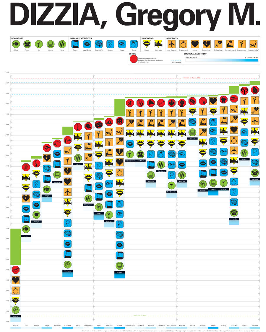
After searching the internet for good examples of diagrams and maps, I stumbled across this Feltron annual report. It certainly appeals to me in the sense that dull and boring figures can be presented in aprofessional yet visually interesting way. This report is actually a report of his life. These maps and diagrams reflect the travel, photography, music, food, drink and reading contained in the year.


There are many more examples at Feltron.com
I found this awesome book thanks to David, and I am just flicking through to find relevant examples which I can work into my own stuff. Now that I actually have some sort of format and subject, I am trying to focus down my investigation which has been all over the place in recent weeks. I have had no sense of time management on this and was confused about the outcome until last week. I do have some examples from the book but I am unsure as to whether they really do inform my design decisions.

I want to create a book which illustrates identity. I have had to move quickly on this so I extracted the fingerprints of 16 people and also took a photograph of their palm. I have formulated a page design which I want to have a continuous theme but not be boring. I have had to amend the rules as without the colour the piece just would not work.

I want the book to come to sort some of analytical end but I am unsure of what form that will take. I have had an eternity on this project but its been hard to get my head around, and actually focus on one specific area. Now that the focus is in place I can move on.
I have really tried to tackle this project in the right way. Take inspiration from secondary sources, draw on ideas from primary research and integrate a style of design that suits my target audience.

After randomly selecting 'how to play 20 questions' I was really pleased. It really could have been much worse. I had a few ideas and I have managed to work in two main ideas I had and evolve the initial concept I had. My product was aimed at children and teenagers on long journeys. This seemed the most likely situation that I thought where they would want to know how to play 20 questions.

Buses and trains were a good place to start but then I started to think about children going on holiday with parents, and I then I started to develop my ideas to become more family orientated. This seemed to fit better as the designs I was creating for children would not have been appreciated by teenagers. However, younger children could still identify with a more 'grown up' approach because of the natural aspirations children have to be older.

I did a little market research to see where my target audience went and what they did, and where they eat. The fast food restaurants such as McDonald's and Pizza Hut seemed to be most children's choice of food. I went to these places to ask about what they provide in terms of entertainment for children, and got a sample from each restaurant. Most of the things I got were pictures which the child could colour in. I found that most went on holiday and most were bored on long journeys. Many of the older children listened to mp3 players or played games on their phones.

This made me also think about how much news coverage is dedicated to children watching television and playing video games. The natural progression from there seemed to be that I should devise a campaign to give children and families the opportunity to talk more through the use of the game. This meant kids were occupied but were also bonding with parents and siblings.

I decided in the end to create a card, that was like the design of a credit card which the child could carry around with them. It would perhaps make them feel important and fulfil their aspirations of maturity and independence a little. The instructions are on the back of the card. I took inspiration from the Chris Collenberger illustrations for the logo I made. I chose to use 20Q because that is what the game has always been referred too as.


The next step was to create a poster for buses and trains where children could text the number on the poster and recieve instructions on how to play via their mobile phone. This may also indirectly appeal to a bigger audience and is also a way to get people talking on public transport instead of burying their heads in the metro or closing themselves off to the rest of the world via mp3. I decided to use a 'colouring in' style for the typeface because of the research I where I collected stuff for kids from McDonald's, etc. I found colouring pictures, and books to be prominant features in all of the childrens entertainment packs.

The design decisions, I feel, were well informed and help tie down my audience. The use of colour, typeface, layout and logo would appeal to a younger audience, and the language use would appeal more toward the parental side of my target. The reason for using slang was to make the design more personal and the language could be changed for different areas of the u.k.

Overall, I am impressed with how much thought and time I put into this project. I feel I have got strong resolutions built on a solid concept. This was one of the more enjoyable briefs I have had.

Edit: had my crit/evaluation today and some issues regarding target audience were raised. I didn't really make clear that the target audience had been developed from children who were bored on long journeys to families. Hopefully my evaluation clears up any doubts people had.
I have decided to give my 'How to' brief resolutions a hand drawn feel to them, and I have taken inspiration for that from the new carphone warehouse brand identity. It seems to tick those boxes in a world which seems to require 'organic' and traditional graphics.

This stands of for me and really love the t.v advert created by CHI&Partners, which is both cleverly animated and simply illustrated.


This is a quote taken from the CPW website.
We’ve represented this in our new look with a hand drawn version of The Carphone Warehouse logo and a specially created hand drawn font.

This new look and feel can be seen across all our Communications, both external and internal and features in our launch adverts, A 60 second history and There was a time.
The new logo pictured here is a breath of fresh air compared to the usual heartless logos created for the phones4u and other mobile phone brands. CPW already had established a market status but this hand drawn identity has that personal touch which the audience want.
The website continues with the theme running alongside their usual advertisements.


I decided to just look at everything and anything in the library, and pick out some examples of on the edge design. Nothing can be more contemporary than the examples in magazines, right? I was flicking through this months designweek and found a really nice typographic example. I think you'll agree the typeface, setting, background, position, and all those other things are spot on in this piece. I love that offset of colour, but more so the actual shape of the letters and how they can be manipulated to be taken in as one image.

I haven't begun to read all of the copy but already I just love it. It's as though the copy and message is irrelevant because here I am staring at this piece wishing I had done something similar.


Seen as I am looking at illustrators at the moment, I thought I would post the work of another illustrator who has inspired some of my designs for the 'how to' brief. These particular illustrations are for masterfoods, who supply nutritional snackfood for kids. These child orientated characters are both eye-catching and simple. They just seem to fit with my sort of target audience.

I just like the style of them, the use of colour makes them jump from the screen and can be used both on screen and in print.

This is definitely the type of illustration I would look to take inspiration from on my project. Of course, Berger does not stick to children's illustration, he has a diverse approach which takes on many different styles depending on the target audience.

If there is anything I need to do more, it's open my eyes. I have to admit I have been quite closed off from the world around me. Getting stuck in the same old routine for idea generation and not looking for any real inspiration harms my personal creative development. So, today whilst flicking through creative review I found an article on this London based illustrator and I liked the illustrative style he had. His website has a taste of what to expect from him

I felt that this type of design related to my pure brief design. This example is one which made me think about my own poster design for the pure brief. I think the illustrative approach is quite similar although the detail in this is much more apparent than in my work.

This example is probably my favourite which was taken from his website. I also like the fact that illustration makes it on to the front page of g2 (every issue I have seen has been just a bog standard photograph).
I have been looking around the net for an orange mobile campaign that I have not been able to find but I remember seeing somewhere before. Now I have found some examples, I shall post them. These illustrations by Marcus James were part of a poster campaign for Orange some time ago. I think I remember seeing something similar when I arrived for an induction in one of the old studios.

This approach is something I can relate too as I find typography can be stunning on it's own without the use for complications. The simple look, I think, is much harder to master appose to poster, or spread full of illustration, images and bright colours. I feel designers sometimes try too hard to make things work, rather than allowing the shape of typography to capture and hold attention.

Is this one of the best campaigns around? no. However, I think it takes a certain amount of guts to pull out something like this on what I assume would be a massive budget. I would like to work with this approach and develop my designs further. However, I want more of a hand drawn feel to my work.
I found this guide book in the library all about perspective. It could be really helpful, so I'll post up some scans. It has loads of examples which might be useful to my development. It has examples from basic perspective to more creative perspective and everything in between..

This is a very basic example of perspective showing what the eye sees from 2 different angles.


These are two examples from the book of simple one point perspectives.


This next example includes tonal shading as well as a two point perspective.


I have been doing some research into the subject as an extension on the session we had as part of the visual language module. I found a book in the library called 'Pictograms Icons and Signs' and I must say it has been helpful when developing my own sketches. Mine were a little complicated so I have used the book to work on my own into something more professional looking.


These icons are a great example of commercial icons which were used in the yellow pages. Even without colour we still have a good indication into what the icons represent.


So, I come back with renewed hope and an idea of what I would like to do for the next part of this investigation. My experiments have been lacking and I need to tighten up on this project. I am still confused as to what I have to actually produced for this as my brief says nothing about target audience and the fact that this project has to come to a head with some sort of product or final piece. I was assured in the crit that I needed a target and a focus so this should hopefully clear that up.

I have decided upon using identity as the focus of the brief, and continuing my investigation into line using natural lines. I'd like to create some sort of book of illustrations which will look at the differences in hand lines and also finger prints. I want to take photographs of peoples hands and also get an finger print from them. I will then use digital illustration and copies of the finger prints and focus one page per person. Analysis will go with the hand lines to show the various lines a palm reader uses when telling fortunes.

As for the target audience, first and foremost the people featured in the book would undoubtedly have an interest and other people who could be interested in the book could range from people interested in spirtual enlightenment to those who are interested in science and nature.

The questions I got back from Leigh, Mitch, Alex and Lauren were all suggesting I keep to the natural theme in one way or another, so I this only reinforces my decision to keep on track with this and leave behind the landart which was beginning to seem more like a fine art approach.

Rules = Can only use 4 colours + stock
No photography
Has to be a book
I had a few good ideas to go into the crit with today. I had reservations about how the group would respond but they all seemed quite positive. I did my usually thing like talking quickly and cramming a lot of stuff in but not trying to be confusing at the same time.

My idea about designing a card a bit like a credit card for kids was one idea I thought would be challenged. However, everyone seemed to embrace the idea and did not pick out any real sticking points.

I have other ideas too which I will post about once I have decided on one to develop. I really like the card idea myself but I don't want to get stuck on one idea like I did with the book brief. I have to be realistic about what can be done in a week but I am happy with what I have done so far.
Just got this as my new brief, and I am really very happy, especially when I saw what I could have ended up with. I have already considered my target audience and what form my ideas may take.

My target audience is going to involve children/teenagers who are bored whilst travelling. I thought of this before even doing any research into the game itself. After researching I found that 20 questions can be played by anyone and everyone and more importantly it can be played anywhere. It's free to play and it's good for long journeys and keeping children entertained.

My ideas are already starting to take form and I am thinking that the scale of this should be fairly small and so it can be carried around easily. My audience definitely need to know the rules of the game as well as maybe some suggestions for typical categories they could choose when playing the game.

I need to do some market research now to find out where my target audience goes, who with and what they eat, watch and see. I need to be obviously careful when dealing with children and young teenagers so I am not going to be stopping them in the street. So I have decided to sign up some chat and discussion forums and pose questions and hope for replies. This seems like the best thing to do given the amount of time I have.

Some of the questions I will pose are:

What age group do you fit into?
8-12
13-15
16-18
19+

What's your favourite fast food restaurant? (one can choose more than one)
McDonalds/Burger King
Pizza Hut/Pizza Express
KFC
Subway
Other (please state)

Do you go on holiday? If so where?
Abroad
UK

Do you hate long car/bus journeys?
Yes
No
It's ok

What do you do to pass the time on journeys? (you can choose more than one)
play games
listen to radio/music
talk
other (please state)

If you play games, which do you play?
electronic games
word games (20 questions, I spy, etc) (please give examples)
I had a little presentation crit and I thought I was doing ok, even though I had not really spent as much time as I would have liked on this brief. I explained what I was trying to do, and I feel as though I have become lost in experimentation, which I thought was a good thing, but I have to almost reign myself in and restrict my work to something with more focus. I need a target audience and a final piece at the end of the brief, something which I haven't thought about. I am annoyed with myself because I should have thought about all of this instead of going off on a tangent with different experiments.

The only good to come of my wildness is that I have alot of experimentation to draw on and make some design decisions. I'm still enjoying studying Land art but I feel as though its something I am doing for myself rather than for a fixed audience. It's as though I thought this was going to be an investigation with an answer to 'what is a line?' but not to produce something of any substance.

The next thing you'll hear from me on this is when I finally make a decision on where this is going. I need to decide and quick!

These are a couple of images of a mini land art experiment I did. It all seems pretty pointless now though...
I thought I would take a few minutes to talk about this brief as I think it's the first brief I feel happy with. I feel I have a good deal of research, ideas and resolved finals to feel good about my time management. At first this brief felt like something that would get in the way, but whether I win or not I'm happy with the work I have produced and this is not often the case, particularly on a brief that lasted just a week.

I had my feedback from fellow students and there were some opinions on the aesthetics of the finals but nothing that would affect my final outcome greatly. I realise I could have tweaked a couple of things and darkened the colour, but I felt this was all down to personal preference. I submitted my entry online at www.dontpanicmedia.com a little while ago and now I am ready to move on to the next brief.

Overall, I have enjoyed working on this but that is mainly because of the way my ideas came together. I may decide to tinker with the final a little more before the module submission but I don't think it requires a complete overhaul.

In the end I decided to make a montage/thumbnail poster with different babies on and different names on the labels. Some were clearer than others and the only potential flaw I see in the work is the scale of it. Some of the labels may not read as well as some of the others. At A2 scale this would not be a issue though.

Seen as the target audience for this poster is older students who like to be made to think and rethink, I believe that this poster would appeal to them and but I also feel that the message is spelt out a little too much. However, I would rather have the concept there than risk people not grasping my concept.
In this session we looked at lighting as well as using a light meter to get the correct exposure. Will, Jonny, Ed, Luke and I were all in a group together and were basically taken various shots to gain a better understanding. Jumping into the process of taking images was better than learning from a book and I felt this session could have lasted longer. I have a few examples of images taken but Will has the rest of them and I should have got more examples from him.

I was in some of the shots but these were the only ones I could find.