new blog can be found at a-townend0811.blogspot.com
I'm damned if I'm gonna leave this blog on 149 posts...
new blog can be found at a-townend0811.blogspot.com
new blog can be found at a-townend0811.blogspot.com
After a lazy month and a holiday to Wales, I feel sort of refreshed as I rub my eyes and yawn my head off, and its already 10am. I took some photos on holiday none of which had much to do with graphic design, well nothing did. It's just hills, trees and sheep. I did make a neat diagram of the number of people to sheep I saw during the day, but its hard when you wake up to thirty odd outside the window.
I won't go in to much detail here about what I have and haven't been upto. I'm in the process of moving blog. God it's so stressful trying to find the right URL. At least I don't have to move any boxes of posts.
I'll put the new address here once I've got one sorted out. For now though, now you know I'm alive, I'm finished here.
Onto year 2. I'm both dreading it and looking forward.
ha.and that was my 100th post of the year too.
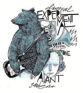
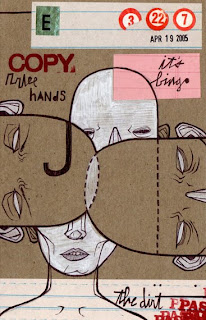 Another great illustrator here. I seem to be swaying toward illustration much more than I used too but don't worry, I still view type and layout as my main thing. Nevertheless Matt Cipov's website is awesome. His illustrative really appeals to me.
His approach is totally different from other illustrators I have looked at like Kate Moross. He works with crayon or pastel and uses quite abit of different coloured stock. I am a fan of colour injection and this is just another way of going about it.

I have used crayons and pastel before but I always thought it looked a little messy and a little gcse. However, this type of thing urges me to experiment again.
His type work, although few and far between, gives his pieces a much more finished look. The bear and guitar one is quality.
Reflecting on my first year, now that the work is out of the way
12:48 pm
•
misc,
reflection
•
0
comments
![]()
First of all, despite my worries at the start of the year and thinking about how I would cope with the step up to degree level, I know now that it was a step I had to take if I wanted to make it in industry. I didn't apply anywhere else last year other than here, and I didn't realise just what was expected of me and what the course was like. All I knew was that I was ready to leave and try again to get into a job at any level.
I took the interview and went to open days still unsure of what to do. In the end I was the only person out of our whole group to be accepted. That made me feel really good about myself and the work I produced at that point. Obviously, Lorenzo and Fred had seen something in me that they didn't see in the others from my course. I never got on with them anyway so, whatever. Last year seemed like I was a big fish in a small pond. I had some industry experience and already had a focus on graphic design rather than an interest in illustration or art. However, I relied on my finishing skills to get me through. I enjoyed making nice looking pieces and got to do stuff like the college hoody in between.
This year has been brilliant. Making something look nice isn't acceptable. No-one is really impressed by aesthetics alone. There are also loads of different people with strengths in different areas but the important thing is they all have one common goal. Everyone wants to succeed. Everyone works hard and they get out what they put in. These are the best people I've worked with for sure. I know I'm a reserved character and I don't get involved as much as I should but this year has proved to me that I made the right choice in staying on. The latter part of the year has been better but the start of the year was beneficial. Had we not been thrown in at the deep end, we would not have progressed as much as we could have.
There's been ups and downs on a personal level. I've coped with some things well and others not so well. I doubted myself at the start and almost left, but I'm glad I got back on track and now I feel like I can do anything. I still doubt myself and I'm still my biggest critic when it comes to work, but I can deal with it.
No doubt next year is going to get harder still, but I just wish we could keep Amber and Jo.
I didn't want to write loads here, just something to round up the year.
Thought I'd upload it here. It is done but there might be spelling mistakes and stuff so I'll take care of those. My presentation follows similar lines to this, so I hope you won't all be bored on monday. I'm up first too so I need people on my side.
Link here just hope it works.
feedback appreciated
Link here just hope it works.
feedback appreciated
Just looking through my work as I sorted it out for submission I had mixed feelings. I felt as though the quantity of work had fluctuated but the quality had improved, and as for the research and how I approached that I feel as I have made more progress in the last module than I did in the past year.
1. What skills have you developed through this module and how effectively do you think you have applied them?
The main one would be the development of my illustration skills. On the last speaking from experience brief, my illustration took off. For something that I had admired for a while, more so this year than ever, I feel as though I've really taken to it. I know in my own mind I am not an illustrator by any means but I can hold my own when I can take my sketches and work with them digitally. Throughout this module that skill has developed from a weakness to a strength.
The final resolutions for the 'Speaking from experience' and the 'How to' briefs really do show the best of my illustration skills, more so the speaking from brief but I love the hand drawn typography I did too. I feel like this is another string to the bow rather than a career but I feel much more confident using illustration than I did before. The tutors asked us to push ourselves, and I do think that I did. I pushed myself outside my comfort zone and persevered with this approach. Studying the work of others helped my grasp a basic understanding and from there I wanted to explore how that type of illustration could be used across different media, like packaging, appose to always being in a poster format much like Kate Moross' work.
2. What approaches to/methods of research have you developed and how have they informed your design development process?
I think I've just opened my eyes a little more to feeling that everything in graphic design has to take inspiration from somewhere and for this module in particular, you will see I have done more visual research than ever before. The work of Kate Moross has shaped my final project quite heavily, along with inspiration from illustrators such as Parra and Ivana Zorn. Never before have I put some much importance on seeking out appropriate approaches to my work as I have for this final brief.
I started the module with a real focus on getting opinion through qualitative and quantitative research. Making questionnaires and using online surveys as a way to inform my decision making. However, as the module progressed I felt that I was putting far too much emphasis on this type of research. Although, it is a vital ingredient, I feel it should not be carried to an extent that hinders the visual research process. As much I stand by the fact that you must have a great concept before you make things look pretty, I feel that some of my work looked quite generic and literal. Therefore, I wanted ease up a little on the surveys and focus more on the visual side of research, again, something that I had never even looked at before this course. If I had not looked at illustrators work I would not have been inspired to pick up a pen and draw.
3. What strengths can you identify in your work and how have/will you capitalise on these?
The strength for me is still very much the execution of my ideas and bringing them to life. I am still very much involved in the digital side of design and some may argue that I rely on digital a little too much, but with my new found illustration skills I feel that I have something more to offer as long as I keep practicing and taking risks.
As mentioned previously the quantity of visual research I've done has outweighed the amount I've done in all of the previous modules. It's certainly changed the way I work now, and hopefully, I'm going about it in the right way. This visual research has really helped my idea generation and have enabled me to take inspiration and come up with something I didn't think I could.
I think my overall awareness of what works and what doesn't helped me through the module. I really enjoy layout work, and was thrilled about the type and grid brief as I felt my layout skills were good before. I felt comfortable using InDesign and came out with a some minimal but aesthetically pleasing spreads for Craig Laing's article.
4. What weaknesses can you identify in your work and how will you address these more fully?
My main weakness before the last and even at the start of the last brief was making design decisions and moving on far too quickly. I was trying to make the scotch egg before I had all the ingredients, so to speak. Luckily, I was pulled back and reigned in and I benefited from that, as did the work I produced in the end. If I had pursued the first idea that came into my head I would not have had the success that this had.
The quantity of my work has been up and down, and whether I have justified my design decisions enough I am unsure. I realise that I am expected to work hard, which I do, but I also feel coming to a decision is a natural process, and having a huge quantity of work is not the be all and end all. However, I do agree I could have had more ideas down in the form of design sheets even if I did not intend to use them for final designs. As it happens I only rejected 3 or 4 designs in the final brief, where as I did loads for the pure brief.
5. Identify five things that you will do differently next time and what do you expect to gain from doing these?
I would like to just sketch more. Having looked through my work, with the exception of the pure brief, I feel as though I don't sketch out enough ideas. I naturally filter the ideas I know will never work and don't waste time sketching. I think getting the bad ideas out is a part of the design process, and I need to address that.
Although I thought my time management was ok, the set back was trying to think of different possibilities in the second week still. I need to re-organise myself at the time and change my timetable. In the end I did benefit from it as I produced far better work, but I had to work fast in the last two weeks, and it meant I had to print the finals myself.
I definitely need to look at other media and workshops I could exploit to benefit my work. The main thing that sticks out in my mind is that I have not used the screen printing facilities. I would have liked to have used it on this last brief but I felt as though my designs were too complex in terms of colour for screen printing. I also secretly felt put off due to the fact that I am still unsure of what I can do in there. I've had two inductions, and I'm not 100% clear, so I felt the risk was too great.
I still need to take more note of outcomes on the brief and module brief to aim for the highest grade. I don't think I have done too badly this year and I have been consistent and hit mid 60's throughout but I feel that if I read the outcomes I could manipulate and organise my work and focus on these outcomes and make sure I hit them. I am hoping for my highest mark of the year on this module as I have felt the most at ease I have ever been throughout the year. I have panicked about other issues outside the work and I have got on with it.
I know I also have to dedicate more time to the studio, as much as it pains me to admit it. I find it hard working in there with the noise and distractions, but I feel I will need to use the studios more next year outside timetabled sessions. I am being picky as I work hard enough and get the work done but perhaps I don't have enough input from my peers on my work, and that could hinder me later on.
6.How would you grade yourself on the following areas:
Attendance 5
Punctuality 5
Motivation 4
Commitment 5
Quantity of work produced 4
Quality of work produced 5
Contribution to the group 3
overall, I am super happy with what I have done which is an unusual feeling. I have had nice comments from other people in the group too, and that has helped a lot. I appreciate and it makes me feel as though I am doing something right. I just want to take this years progress and capitalise on it and develop further in the second year. For the first time in a long time I feel like I do this.
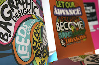
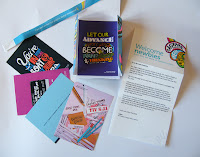 Without a doubt the last 2 weeks have been a struggle, but I'm there and the finals are done. This is the first time you will have seen the packaging, even though it has been done for quite a while. I wanted to make sure I had all the contents of the pack ready before showing these. The packaging is a simple card stock and printed digitally (I wanted to screen print them but I decided against it once I had my designs. As you can see there is a hell of a lot of layers and colours, so screen printing was not the best option.) I also did a variation for fashion students. This shows how it could work across next years year group.
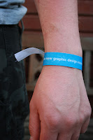
 The postcards are printed on proper postcard stock, however they are not double sided. I don't think this matters much as I don't expect the students to start sending these, unless they send them home. The wristbands are made from fabric tape and I used heat transfers on them. They came out rather well, despite me having reservations about printing them earlier on. I got a friend to wear one and photographed him so you can see what it looks like when worn. I did variations of those too with different messages on, plus a thinner wristband for fashion students as most of them are female.
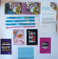 The welcome letter was the last thing I did but it will be the first thing the new students see. I really love how this looks because I reused the pattern from the packaging and still looks good as part of a simple letterhead. I am really pleased with how all of this came out and I will talk about it more in my module evaluation.
Overall, I feel I have pushed myself in this brief, and despite not having the top trump cards, the resolutions I did come out with were just as strong and make the pack what it is. This brief was worthwhile and I felt I have progressed hugely over the past year.
 These are the last two resolutions I intend to use as postcards within the pack. Someone said in one of the crits it would have been nice to try a variety of styles so I wanted to move away from illustration for a moment, because the potential students may be put off if the whole resolution was based solely on illustration. That said, I realise also that there has to be a form of continuity running through the pack so that any resolutions seen out of context could be linked back to the pack. I feel I have addressed the issue of continuity by adding the B.A Graphics tag to all of my postcards.
As of yet I have not decided whether these will make the final pack but it seems more likely now that time is running out, and I won't have time to explore the top trump cards. I want to make sure my body of work is up to scratch rather than creating a lot of resolutions. I don't think not having the top trump cards will hinder the pack too much, it would have just been better to have them in there. The last of my resolutions will be the welcome letter, which will be placed inside the pack also and will be the first thing the new student sees. I want this to be interactive also, but I haven't decided how so yet.
These are the latest postcards. One of which is inspired by Ivana Zorn, and the others inspired by Craig Damrauer.
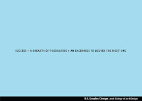

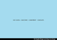


I thought I should post some variations of my postcard designs to show how I could diversify with colour to give a different feel to the postcard. I think you will agree that my results show that my designs could work on any colour. I now just have to pick the correct one to use as part of my final. Other postcard designs are on the way but I felt these are my most successful ones.


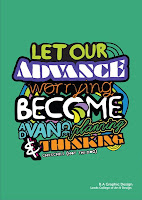

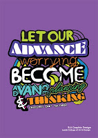
 Just a quick mention for Ich & Kar. I nabbed this from David's blog because I felt it tied in very well with the approach I was taking to illustration on my project. The vibrant colours and these emotive shapes link to what I have been sketching. It's also interesting to see this work in a different format, even though I can't appreciate in person this works well on a wall, as well as it would on packaging.
I'm unsure of the message if any, and I realise I cannot just say its pretty but what I attracted me to this piece was the way it looks rather than what it means.

This week I have really got stuck into making my finals knowing the chaos that would ensue at the digital print facility in the coming week. I finished two variations of my packaging which I printed on cheap card stock. The colours did not come out as good as I'd hoped, they have much more of a pastel finish, where as on screen they are much more vibrant. I'm still impressed with them though and they look really professional once made up.
The postcards are done too. I put together 4 or 5 different designs, and I have chosen to put them all in but I favour some more than others. My illustrated ones fit my theme well and I believe, are the most successful. However, I wanted to include a variety of approaches and so I chose to create a photography based postcard design and a very simple typographic design with featuring an equation inspired by Craig Damrauer.
I also made the wristbands, a few resolutions for the graphics course and a variation for the fashion course. These came out better than I expected. I used iron on transfer paper on cotton tape. The results were more vibrant than I expected and I was pleased with the results. I shot some photos in context and some of the wristbands in full so you could see the detail.
Overall, I am really pleased with what I have done over the year but these are the best results I have had all year, which is how I wanted to finish the year.
speaking from experience - development and possible finals
8:24 pm
•
Design Practice,
OUGD103
•
0
comments
![]()
 Last week of real hard graft this week. Damn, this has come around quick, maybe too quick and so my hand his been forced a little into making decisions. I have looked at plenty of other designers stuff and made decisions into where I want to take this project but not made many efforts into put these ideas on paper. Yesterday and this morning I put my best ideas onto paper and ran with what I had. I have a couple of postcard designs already set up and so this is the third and I believe this will be a final.
When I designed it I didn't really think about scale and now I'm feeling as though all the hard work I put in is kind of wasted on a postcard so I want to do a large scale poster print of this too, I'm just thinking that a duplicate of one of the postcards might be seen as a cop out but I feel its a nice piece of design that the kids might want to put on their wall as inspiration for what they are about to study. This literally took me most of the day. All the type is hand drawn scanned and coloured. I'm proud of it but I know some people could knock this kinda thing out quicker. This is totally out of my comfort zone so thats why I'm so proud of it.
For me, this shows where I have come from and where I am going in terms of how I design and what I design. Before this project I had not focused on illustration so I felt like I should because I admired alot of the work other people were doing, I just wasn't convinced I could do it, until now, that is.

 These next images are of a sketch I've done for the packaging. I have the net finished I just need a design to go with it. From the moment I thought about how to do the packaging I wanted to cover the pack with illustrative elements and lots of colour. I am still planning to have a slipcase over the top and I hope these sketches will look as good as this once digitised. Lauren said in a crit that I should look for such a polished finish on illustrations like these as the beauty and charm is in the little imperfections. I put this into practice on this postcard so I am hoping to do the same with the packaging.
I am still experimenting with the wristband, I have a design that I am happy with. I did'nt want it to be too graphic heavy so I only spent a matter of minutes on those. I just have to find a way to print them as all the ways I've tried so far, the fabric has frayed. I dont really want to use paper, so I'll see what happens. The top trump cards have not been started yet, but hopefully I'll get those done soon depending how things go this week. I can print them at home because they are as small as a playing card so thats a good thing. Ideally I would want to print at college but I just think I will have enough on with the packaging and postcards.
That's all for now... possibly last update of the week will be friday.
Today, I quickly compiled a list of the works that I want to go in the presentation and my digital portfolio. Can I say right now how awesome it is to do a digital portfolio. The number of years I have had to mess around mounting work that was never straight almost killed me.
Now, here a few images of my work over the year and to be honest it doesn't look all that bad for a collection of work. I really beat myself up about what I had done early on but its not so bad after all.
The digital portfolio will have a selection of these works and I intend re-photograph some stuff with a camera from the photography department after the next module deadline passes. I think they have been short of cameras down there as of late so this seems like the best option.
Convince/Persuade us
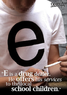 This is from the first brief we had this year and I am including it to show how far not only I have come but how far the group has come. We thought that the series of posters we did looked really professional, and to me, this first project was a taster for what was to come. To start with I was really bothered about working in a group, but despite everyone not knowing each other that well we pulled together really well. Looking back we could have done some stuff different but it was a good set of visuals to start with.
No News is good news
 These were for the 'no news is good news' brief and I decided to focus on football violence as my focus of the project. It was something I had background knowledge on anyway so I felt like it was a good and relevant subject. This first poster was based on Visual Literacy and using the English flag as symbolism. It was perhaps a little controversial as it paints england as a real violent nation that use sport as a way to inflict hurt on other communities as well as their own.
 The other poster did not really have a message I just used illustration of found objects associated with football to spell the word violence. If I think about it now, it communicates that you don't always see violence but it is happening behind the scenes, and again football is used to fuel it. Of course there are rivalries between fans of different clubs but using violence towards each other makes the football redundant.
Wortleigh: A Typeface for Leigh Wortley
 This was an enjoyable brief for me where I had to make a typeface for another member of the course. Leigh Wortley was the unlucky person I was paired with. For her typeface I incorporated traits that she told me about but also traits which I saw in her from day to day. At the time, I thought this looks a little like it was made for a guy but it does fit her personality well. I want to re-photograph this because I printed it off in sugar paper and it looked better than this.
Mailshot: No news is good news part 2

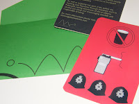 These, again, will have to be re-photographed and they are based on solving the issue of football violence in the form of a mailshot. I loved how these came out when I did them I thought they were the best thing I had done all year. For me, I felt that these had signaled that I had turned a corner because the format for this was different to anything I had done before. Before this I did posters and identities and that was about it. Working on a beer mat and envelope, etc helped me get to grips with what works on a certain scale and format.
Book of 100: Can Convention


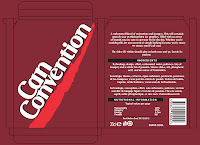 These images are from the 'book of 100' brief. When this was first assigned, I felt like I had ages to work with. This was the first brief I really encountered problems. I was too quick to make decisions before actually thinking about every possibilites. This meant that I was left stuck on week 3 of the brief, and felt like I had done all I needed too. For sure, this brief opened my eyes and I found out how precious time was whether it be a one week or a five week brief. The finals were ok, but my finished book looked tatty, as I got let down by the print department.
What is a line? Identity

 This was a much more successful book project for the 'what is a line?' brief. After experimenting and treating this project like an investigation it was a raise against time to actually come up with a final. This brief was interesting and it helped show me how to cope with multiple briefs with differing deadlines. The book itself I was happy with visually and the cover looked awesome. Again I want to photograph this again with a better camera. I printed on a see through stock on some of the pages which I still think is an ingenious idea and helps with interactivity.
Collaboration- If you talked to me...
 The next image is from the collaborative brief I did with Lindsey. I loved working with Lindsey and had a good thing going. We both worked hard on it and I think we learned from each other. We both had different ways of working and we both had different strengths. I had the skills on the mac and she had the photography skills, both of which were vital to our finals. It was a positive experience which left my mind open about more collaborative work.
This is a full list of works I am looking at putting in the presentation and portfolio, but thats all for now.
Presentation
Craig Article – spread(s) + design sheet(s)
Leighs typeface – photograph sugar paper + work sheet
20 questions – poster, photograph card
Football hooliganism – posters (experiment + final)
Red Posters series – Illustrations
Exhibit A – look how far we have come in a year
Mail Shot – Design for logos – photograph mat, envelope, card.
What is a line book – photograph book and spread
100 book – can cd + plus packaging, book design – what went wrong? Everything
Collaboration brief – how I had to compromise
Portfolio
Craig Article
20qs – poster + card
Red posters series
What is a line book + spread
Mail shot – envelope, beer mat, card
Collab brief – serious tone
Leighs typeface
Now, here a few images of my work over the year and to be honest it doesn't look all that bad for a collection of work. I really beat myself up about what I had done early on but its not so bad after all.
The digital portfolio will have a selection of these works and I intend re-photograph some stuff with a camera from the photography department after the next module deadline passes. I think they have been short of cameras down there as of late so this seems like the best option.
Convince/Persuade us
 This is from the first brief we had this year and I am including it to show how far not only I have come but how far the group has come. We thought that the series of posters we did looked really professional, and to me, this first project was a taster for what was to come. To start with I was really bothered about working in a group, but despite everyone not knowing each other that well we pulled together really well. Looking back we could have done some stuff different but it was a good set of visuals to start with.
No News is good news
 These were for the 'no news is good news' brief and I decided to focus on football violence as my focus of the project. It was something I had background knowledge on anyway so I felt like it was a good and relevant subject. This first poster was based on Visual Literacy and using the English flag as symbolism. It was perhaps a little controversial as it paints england as a real violent nation that use sport as a way to inflict hurt on other communities as well as their own.
 The other poster did not really have a message I just used illustration of found objects associated with football to spell the word violence. If I think about it now, it communicates that you don't always see violence but it is happening behind the scenes, and again football is used to fuel it. Of course there are rivalries between fans of different clubs but using violence towards each other makes the football redundant.
Wortleigh: A Typeface for Leigh Wortley
 This was an enjoyable brief for me where I had to make a typeface for another member of the course. Leigh Wortley was the unlucky person I was paired with. For her typeface I incorporated traits that she told me about but also traits which I saw in her from day to day. At the time, I thought this looks a little like it was made for a guy but it does fit her personality well. I want to re-photograph this because I printed it off in sugar paper and it looked better than this.
Mailshot: No news is good news part 2

 These, again, will have to be re-photographed and they are based on solving the issue of football violence in the form of a mailshot. I loved how these came out when I did them I thought they were the best thing I had done all year. For me, I felt that these had signaled that I had turned a corner because the format for this was different to anything I had done before. Before this I did posters and identities and that was about it. Working on a beer mat and envelope, etc helped me get to grips with what works on a certain scale and format.
Book of 100: Can Convention


 These images are from the 'book of 100' brief. When this was first assigned, I felt like I had ages to work with. This was the first brief I really encountered problems. I was too quick to make decisions before actually thinking about every possibilites. This meant that I was left stuck on week 3 of the brief, and felt like I had done all I needed too. For sure, this brief opened my eyes and I found out how precious time was whether it be a one week or a five week brief. The finals were ok, but my finished book looked tatty, as I got let down by the print department.
What is a line? Identity

 This was a much more successful book project for the 'what is a line?' brief. After experimenting and treating this project like an investigation it was a raise against time to actually come up with a final. This brief was interesting and it helped show me how to cope with multiple briefs with differing deadlines. The book itself I was happy with visually and the cover looked awesome. Again I want to photograph this again with a better camera. I printed on a see through stock on some of the pages which I still think is an ingenious idea and helps with interactivity.
Collaboration- If you talked to me...
 The next image is from the collaborative brief I did with Lindsey. I loved working with Lindsey and had a good thing going. We both worked hard on it and I think we learned from each other. We both had different ways of working and we both had different strengths. I had the skills on the mac and she had the photography skills, both of which were vital to our finals. It was a positive experience which left my mind open about more collaborative work.
This is a full list of works I am looking at putting in the presentation and portfolio, but thats all for now.
Presentation
Craig Article – spread(s) + design sheet(s)
Leighs typeface – photograph sugar paper + work sheet
20 questions – poster, photograph card
Football hooliganism – posters (experiment + final)
Red Posters series – Illustrations
Exhibit A – look how far we have come in a year
Mail Shot – Design for logos – photograph mat, envelope, card.
What is a line book – photograph book and spread
100 book – can cd + plus packaging, book design – what went wrong? Everything
Collaboration brief – how I had to compromise
Portfolio
Craig Article
20qs – poster + card
Red posters series
What is a line book + spread
Mail shot – envelope, beer mat, card
Collab brief – serious tone
Leighs typeface

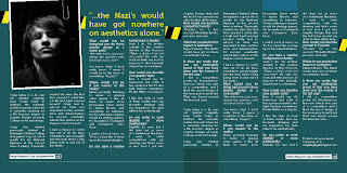
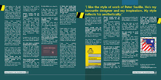 Finally decided to get these layouts out of the way due to them hanging around waiting to be finished. I have enough to think about so I wrapped up this brief along with the printmaking elective and now I can concentrate on the speaking from and the PPD stuff.
These magazine layouts are based on an article I had to write on a fellow course member. I got Craig Laing and I have enjoyed working on this. I had not spoke to him before but he's a very genuine and witty bloke, a mans man, if you like. I looked at his blogs and conducted an interview with him and felt that I wanted my piece to reflect that interview because I could take quotes from that to use for breakouts. I knew instantly two of the things he said that I wanted for breakouts, which shaped his views but also I think will make the reader want to read the article.
The mention of Nazi's could be controversial but that's what Craig is all about, not conforming to the usual safe approach, well at least that's the sort of person I have portrayed him as anyway. Hope he likes these. I wanted to keep them professional and incorporate his work into the layout as much as possible. I used the vector image that he created for a self promo poster and I used the warning tape as used in the Saville stuff he likes.
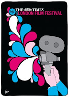


 Just when I thought I had found an ideal visual approach in Kate Moross, along comes this guy. Parra, an underground star in Amsterdam works for Big Active. The work he produces really appeals to me as I am a fan of simplicity but with a degree of professionalism. Parra mainly works on small projects such as posters and flyers. I discovered his work firstly on t-shirts and I have delved a little deeper to uncover his awesome portfolio.
It's his typographic work that stands out the most for me. The composition and colour as well as aesthetic appeal makes Parra a unique designer. His approach is similar to Kate Maross but he has a knack for getting image and type working together beautifully. This has now changed my project for me, I want to focus more on this guy because I love his work, and I think my audience would appreciate this type of artwork.
If you would like to view more of Parra's work go to either RockwellClothing.com or BigActive
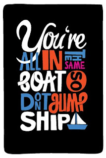
Here is a response I created for the speaking from experience brief. I am quite happy with this at the moment but I would tweak it a little if I were to use it for a final.
I haven't really decided on what messages or quotes I want on the postcards yet but this is something close to what I want.

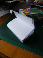


 Over the past few days, before I start designing the contents I thought I'd look at how to make up the box for my welcome/intro pack. I have tried out several packaging nets to see what does and doesn't work, and what the right choice might be for the job. At this point I am not too concerned about scale, but I want the box to be big enough to take the contents I already am working on plus anything I might come up with in the meantime. On the flip side the box has to be small enough to fit through a letterbox.
 These are some images of what I have so far, two of which have patterns similar to what I am aiming for in terms of visuals, which will come in due course. I wish to continue to look for suitable packaging designs which I may have to customise slightly to take the contents.
The next step after this will be to decide on stock and scale.

