Padd Solutions

Converted by Falcon Hive

David Airey is graphic designer I have looked at before, his work is quite simplistic which appeals to me as I feel my work is similar. Whilst searching for type design pieces and books I stumbled upon this interesting article he published.

David Airey's 13 excellent typefaces every graphic designer needs

There is a decent array of styles old and new but one that caught my eye was 'Univers' a typeface designed by Adrian Frutriger, that guy who designed the aptly named fotn 'Frutiger' which is also in the list.

'Univers' just looks nice, its nice on the eye and easy to read. Most important of all it looks quite modern, wouldn't you agree? Well, it was actually designed in 1956. How weird? it doesn't look out of place today at all.
In my opinion type is underestimated by most people who use it, even graphic designers. It's as though it's taken for granted. 'uh I'm making a poster' 'right ill use this font' 'yeah it looks good'... Come on. Type designers deserve lots of credit, type didn't just happen. Even I used to use type without thinking or even considering the craftsmanship.

But what is type.. I'll tell you, its everything. It bails designers out sometimes. When our visuals aren't quite working and we need a typeface to change the way the audience view what we are trying to communicate. Type is such a powerful tool if used correctly and can make or break a piece of work. I have been guilty of using ghastly typefaces, but they were only ghastly because I used them for the wrong piece of work. That grungy font does not just go with anything.


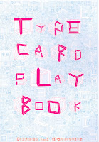
Whilst at the library, I decided to pick out a few examples of typographic design that I liked. This design by Dainippon Type Organization is a classic example of type generation that comes from one form. They used a cube over and over to generate this typeface and makes for very interesting results. This piece goes to show that inspiration can come from in a form and the simplest shapes can result in awesome finished results. So what if this typeface couldn't fit into any other format without detracting. This typeface was made for a reason. To stand alone and has not been created simply to read.

I love it.


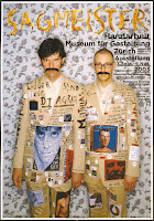
This piece by Stefan Sagmeister looks like a poster for some sort of German art exhibition. The layout doesn't really appeal to me greatly but the type at the top does. Who would have thought to use chips to make a typeface, but oddly enough it works. When I flicked through and saw it, it reminded me of a type idea I had for Leigh's font. I made a typeface out of Quavers and it did look pretty damn good.

Looking back at this over all I would question the legibility of the font at the top and the readability of the block of text on the right. The wallpaper
pattern certainly detracts from the piece.


The final piece I am looking at is by Deanne Cheuk. Following on from the first type brief I was given which looked at manipulating a typeface I thought this piece could be classed in a similar category. Based on what looks like the Rockwell typeface, this typeface could be seen as intriguing and misleading. I think you would associate rock well with a old western cowboy culture. The fonts weight and unslightly serifs further give that impression. However, when filled with this multicoloured pattern, suddenly the typeface looks modern and interesting. I would no longer associate this with a old western culture. The pattern looks as though it should be a associated with an ethnic origin or background. Hence, the reason it seems misleading.


The lack of colour in this version doesn't detract from the overall quality of the piece.


I am amazed. Books actually have a use. They have information in I might need. I have never read a book in my life, but just flicking through I found a good few examples of type and type characteristics.

I found this in a book called ' Stop Stealing Sheep and Find Out How Type Works' by Erik Spiekermann and E.M Ginger. The title alone intrigued me, so I thought id give it a whirl. It has a good amount of detail without boring you. One of the theories I picked up on was font characteristics which is something I looked at when generating Leigh's font.

The author talks about different moods being associated with different type faces or character styles. This could be in its physical form like case and weight, but also in the way it is displayed "Letters can stand at attention next to each other like soldiers or dance gracefully along a line".

I think the typefaces shown here from which I scanned from that section do have the characteristics we associate with them. However, this may because we see the word anger and also have the image behind to back up the point. Either way the typefaces do seem to portray the words we associate with them.


Anger, which is something I tried to characterise during my colour brief is quite similar to the one shown here. The author talks a little about the type of character needed to portray this emotion. "Anger, like doubt, can be described as a dark feeling, that calls for a black, heavy typeface. Anger is not as narrow as doubt. It needs room to expand, sometimes to shout out loud".

Another thing I picked up on was using font characteristics in the same way you would tell one person from another. Facial features is something that distinguishes me from someone else and the same could be said for type. Every typeface is different, whether the difference be vast or subtle. A bowl here, a serif there, it all adds up..

The silhouettes, for example, do not tell us enough about a person to give an accurate description of their personality. The same can be said for a missplaced typeface. It can give out the wrong signal.

However, when we are given visual hints, i.e facial features then we can start to read their personality and make assumptions based on our readings. Typefaces have personalities too and we should use them in the right way and if we do then the message we are trying to communicate becomes clear or even clearer.
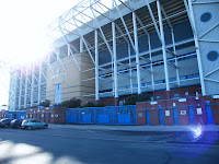
Fresh from a 3-1 victory at the weekend here is the home of Leeds United. Oh yes. I went down to Elland Road stadium this morning to gather some primary research based on the Guardian brief I have been set. I pleaded with the weather girl to give me some sunshine and she delivered.

I'm unsure what I will do with all the photographs I took, but it counts as evidence I was there. I thought about getting research on Leeds United's demise over the past 3 or 4 years and then gather evidence of how they are now on the up. As a Leeds United fan, this definitely interests me quite a bit.

I'll try to apply the things I have learnt already by analysis type and colour, and then generate some sort of opinion.

These are a few photos I took today, hope you enjoy them.


That is my concept. Seems quite odd at first but the material I have produced shows what I mean. I've finished my finals early and I can't get near the studio so I thought I'd post up my thoughts on this now.

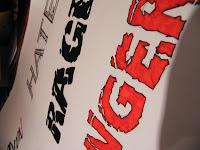
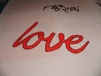
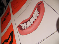
These are a couple visual variations of one of my finals. I rejected these ideas as I felt the black one was too black and the white on the other stood out over the red. I wanted people to see red squares from a distance and then see the illustrations when they get a little closer.


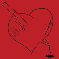
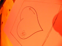
The illustrative part of it was done using tracing photographs and using elements of existing illustration to make up my image. For instance, the knife, I traced from a photograph, but the heart I took from an existing illustration and adapted it. I'm happy with the quality of most of my illustrations but some work better than others. My idea, first of all, was quite simple, (I explained my concept in an early post) and therefore was quite easy to represent. I think I have worked to the brief but been a little cleverer with how I have approached it.

Yes, they are a few things I would have liked to do differently and I will explore them in my own time. First off, I decided to print onto red paper. This was a good idea but I wished I had have looked for some other shades so there was some slight difference between the emotions. For instance, the shade of red for rage would be darker than the shade for love, I think. I would have also liked to have developed the type pieces alittle more, as I found better fonts once I had finished my finals. I know the other fonts work aswell but you never know whats works best until you use a whole variety.

I think, this, as well as most of my pieces have been aesthetically pleasing and had solid ideas behind them. I just wonder if these are ideas are that clear when presented to a new audience. This brief I have tried to make my ideas stick to the visuals, and hopefully I'll get good feedback in the critique.

The thing I like most about my final set of images is that they link up and create somewhat of a cycle. The heart, representative of love, is already scarred from a previous relationship. I wanted this to be clear and I believe it is. When the character is going through these emotions, the scars he/she had have opened back up.

The last illustration for hate (pictured below) plays with the audiences interpretation. Did this person get hurt and emotionally scarred once again by the knife through his/her heart. Or did they get over come with the emotion of two break ups and kill themselves?


Edit: Just had my crit, and all went well. My work was voted 1 and 2 by 2 groups out of 6 other resolutions. No-one really talked about what they thought it meant and someone said it was a little too obvious. Fair comment really. However, I did try to make my idea clear, but this time too clear. I perhaps should have laid it out differently but I still like what I did in the time we had.

I did feel abit for David. His concept and his ideas were well thought out. He didn't deserve to be where he was in the standings. But thats democracy for you..

More pictures.. these are of all the red work..


Illustrator Induction
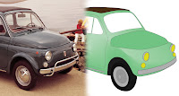
I had my second illustrator induction. I haven't really learnt much at all yet. However, I appreciate how difficult it is to start with. We had to trace this car and start to add gradient meshing. I knew how to do gradient meshing but its difficult to do on more intricate sections.

This is my attempt that I didn't have time to finish. I prefer using flat colour. I just looks better, you know...


I have been working on a concept for my most recent brief which is to define what red means, and what it stands for. I see red as quite an emotive colour. It can be used to signify both love and hate and lots in between.

I decided, after much deliberation, that my concept is 'Red is a stormy relationship'. Although, it sounds odd to start with my visuals do show what I'm talking about when I make this statement. I have split the ten visuals down into 5 ideas or stages of this 'relationship'.

The first is passion, then love, rage, anger and hate. Each idea has type based resolution and a visual one. My thinking behind this concept is that one person feels passionate about another and then they both fall in love. After this one hurts the other and so the love turns to rage. This then boils down to anger and thoughts of revenge, which then moves on to hate.

Here are some images for now and more will be explained about this later, once my final resolutions are finished. I thought I might do my finals as line drawings and use red paper to keep them simple.


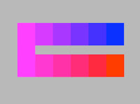
After using the different objects and categorising them, the next thing we did was use different shades of paper to bring out the colour in the objects we had collected as some objects appear differently when places onto different colour backdrops.

This shows the kind of thing I'm talking about...


The colours on the left start to look like gradients when you look at them for long enough. This is because your eyes get used to the colours and the colours start to merge. But in fact, we can see that they are all flat colours when another colour is wedged between them.

This is an example of colours appearing different on certain backdrops.


I'm unsure if my attempts worked due to the shine off most of the objects but I have uploaded my discoveries for you anyway.


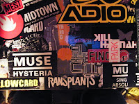
Just when I thought that I had escaped the world of type I've been willingly subjected too I noticed my computer desk. I have covered the top in stickers and now it has a certain charm even though I have to replace some of the worn stickers now and again. The range of typefaces is quite extraordinary. These pictures should give you an idea.


Yes, I love these super macro shots. It's more artistic


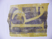
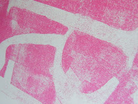
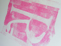
I have finally got some images of last weeks prints I did. They were hard to print as I had quite a thick stencil, so I had to pre-soak the cartridge paper I printed on. They came out ok though. I enjoyed the mono printing to an extent but by the end, wondered what I had actually achieved. There wasn't any real direction to the lesson.

I suppose I was supposed to take initiative and work to the brief. Nevertheless I had fun with colour combination's and trying different techniques, never knowing quite what I would end up with after I did the print.

These are some of the prints I did. Often the stencils looked better than the finished result.


Now, onto today. Screen printing was, again, something that I hadn't ever tried so I was pleased to get the chance. The prints came out better than I expected and the technique was pretty easy to get your head around, although setting up a print was so complicated and time consuming. Looking back at the brief, if I was to do 20 prints it could take forever. However, the results were pretty good. I think I would prefer to use a different image sample next time though.


When doing my typeface for Leigh I noticed something I'd looked at many, many times but never realised how it was constructed.

Blink 182, one of my favourite bands ever had this logo as the one for their last album. It has this layered effect similar to what I've done which I think is to show how the members blend their musical styles and influences.

Even though two or three typefaces are used the logo is still very much legible. The designer, scandalous really had his visual thinking head on that day.

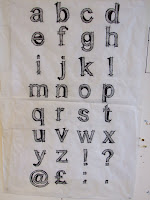
I just had to add these to my blog. It's hard being in a Illustrator induction when you think you know everything, which is being taught so I went ahead a little and created these digital versions of my typeface.

I tried with the pen tool and traced it manually but it just looked awful. None of the lines had definition. So, I tried live trace and it came out much better. I even added some colour.

So, the alphabet soup brief came to a close and I was quite happy with what I had done. I had packed loads of visual thinking into my typeface for Leigh. My chosen words to describe Leigh were; irritable (compulsive), opinionated, good mannered, and also clumsy.

The typeface itself, to me, depicted most, if not all, of these. Throughout the week my perceptions of Leigh changed slightly as I got to know her and talkative was a word, which I could have also used to describe her. Nevertheless I carried on in the same vein as I started but I wanted to portray a split personality, as what she thought of herself and what I thought of her were two completely different things. She said she was irritable and loud. Where as I found her humorous and kind.

I used two typefaces, one a serif and one a sans serif. The serif typeface represented her public image, which she would show to people like me but then theres the other side to her, which is represented by the sketchy sans serif. Because serif typefaces are more of a classic font I thought that I could use it to paint a positive, as people at the time the serif typefaces were created people were more kind and considerate and helpful. I find that too many people nowadays care for themselves. I found Leigh to be the kind of person you don't see much these days. Someone who always is friendly and approachable.

After watching Leigh divulge in her hobby of reading comic books, I looked at a few and found that some of the shading techniques involve crosshatching and I thought this might work well in my font. I tried it and instantly liked it and so used it for my final.

The badge came out nice too and I played more with the clumsyness vibe by moving the letterforms around so they were leaning on oneanother. I didn't do this initially, as the whole alphabet would look messy.


Leigh's work on my typeface did represent me, but more towards how I'm like at home, appose to in college. She said I was quiet, etc in college, which was right. However, the typeface she created was fun, colourful and soft centered. All of which, I am but just not at college. She cleverly used size of letters to try and depict me physically, which I didn't notice straight away but did seem well thoughtout when I did notice.

The work I felt was alittle underdeveloped but it's not her fault, we have all had a tough couple of weeks and I'm just lucky to have facilities at home too. I had to work seriously hard into the night to get mine done. The use of colour lifts the typeface but it just needs alittle more refinement. She initially started out with some good ideas but I think I'm quite a difficult character to pin down (I don't even know me).

She used the guitar hero font but manipulated alittle too much I feel. She just needs to start with that road again but maybe take a different path. She's worked hard so just needs alittle bit of inspiration but I don't give much away.

Credit for the pictures goes to Leigh.. I'm so lazy
Colour, where would we be without it. In a plain old world, that's where. We had a seminar on colour today, which I found quite useful really. Additive colour is used with light projectors, while subtractive colour is associated with ink.

The colour wheel is made up of primary and secondary colours. Primary is made up blue, yellow and red, while the secondary colours are made up from a mix of the primary. The complimentary colours sit opposite each other and cancel each other out. This means they don't generally go well together unless manipulated in terms of tone.

Hue relates to chromatic values, while saturation reduces the chromatic values by adding light or dark tones. Blue is considered a passive colour, yellow is active and red is semi-active.

Just started work on colour, and looking at systematic and subjective types of colour. Quite interesting, oh yes. I felt I actually learnt something. The first pictures are of red stuff our group brought in and then we added it to a huge colour spectrum that ran through the room and into the corridor.


The pictures came out nice on my new camera. result.