As part of the 'Alphabet Soup' brief, I have started to look at font personality. I decided to look at a few examples of font personality before I finished my typeface design for Leigh. What do the fonts stand for? Does colour play an important part? Who are these typefaces aimed at?

Nevertheless M&S have moved with the times and felt a new image was necessary. The colour of the '&' not only splits up the type well but it also seems to relate to their healthy produce.
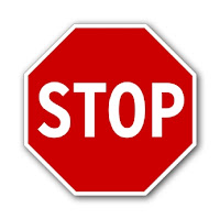 The signage on our roads has a different purpose entirely. It is there to be noticed and acted upon. The type on all signs must be legible and a certain size. The weight of the font also plays an important part as it must be seen from quite a distance. The colour is also important as other colours may not be seen in certain conditions.

Marks & Spencer have built up a high class image since they first opened their stores in 1884. Throughout the years they have kept relatively the same image up until they rebranded the company a few years ago. This logo for the new M&S still has a clean and simple layout but it has lost the serifs. Serifs are generally found on classic typefaces and usually a symbol of elegance and quality. This may have also been changed to open the name to other classes, who may not have bought anything from the store before.
Nevertheless M&S have moved with the times and felt a new image was necessary. The colour of the '&' not only splits up the type well but it also seems to relate to their healthy produce.
The signage on our roads has a different purpose entirely. It is there to be noticed and acted upon. The type on all signs must be legible and a certain size. The weight of the font also plays an important part as it must be seen from quite a distance. The colour is also important as other colours may not be seen in certain conditions. This type of font maybe found on electoral campaign posters as their main purpose is to inform, not entertain.
The next image shows part of 'Gillette's Mach 3' range of razors.
As we are aware, these products are aimed at men. However, if we didn't know, it would not take long to realise. The style, colour and the typeface all have key signs that this product is aimed at men. The way the font is itallicised appeals to men, as it depicts speed. The colour palette is made up of blues and silvers, which appeal to men, as blue is generally a mans favourite colour.
Using this with the adverts featuring celebrity sports stars and you have a winner.


(0) Comments