Padd Solutions

Converted by Falcon Hive

This photographers style appeals to me. It's like nothing I have ever seen before. It's polished and unnatural, however, it features totally natural elements. There is a calm, tranquil feel to the images which makes them easy to look at. It reminds me of an office, which makes the calm and tranquil feel sit uneasy as we class an office as hectic and know it's the last place you would want to be.

I'm unsure why I was attracted to these images but they just stood out as a different approach to capture something like this.
I thought I should look at the work of other photographers. The brief suggested some to look at but I thought I would look at some images that interest me and then link back to the photographer.

This shot, by Wim Wenders appeals to me. The sheer quality and vibrancy of the image is what draws the eye. The colour of the skyline seems surreal but it adds tone and composition. The richness of the colours makes me want to experience the scene.

It almost seems like an action shot. There is plenty going on inside the frame and it makes you look deeper within the image to take in whats there.
New brief alert! Yes, that's right, our new brief entails getting 100 images. I thought that was a little over the top at first but quickly found that 100 photos isn't as much as you would think. This is the research stage of the new brief, so i do not know what I will be using these for. I was asked to get images of objects, places, textures, people and words.

I also was required to print out the 100 photos to a certain size and cut them all out accurately. (They don't want much, do they?) Nevertheless, this is benefiting me in some sort of way. So, here are a couple of photos which I thought came out really well.

The texture is from when I was in Leeds, and is of a manhole cover. The weird structure is from when I went down to my local town centre, Castleford and took a photo of this 'art' piece, which is made out of plastic crates. The other is a close up of a disgarded cigarette packet and the last one is taken from the new multi-million pound bridge in Castleford. It overlooks a boat that got stuck years and years ago and basically rusted up. Locals wanted it removed at the time but it's become part of the history really.


The assessment is closing in and I thought I'd post one last time before the deadline just round up what I have looked at in the last few months and reflect on what I have learnt.

So, I have found the last few months pretty hard but not unmanageable. I knew I was going to get tested in the first few months with fast paced briefs, tight deadlines and so on. What I didn't realise is that by the end I would be proud of what I had done regardless of what the outcome is of the assessment. I know some others in the group do much more in terms of quantity, but that's not my style of working. I think I have changed my approach slightly to how I used to work, and its a change for the better, but I'm not ever going to be someone who does masses of sketchbook work.

I quite enjoyed this module and my work varied in quantity and quality. I found my feet pretty quickly and got into the groove even though it was difficult to start with. I have learnt more in this period than I did on the ND. I feel challenged and I feel as if the people around me have that bit of quality, which makes me want to push myself to keep up the standard.

So, to round up this blog so far, I feel I have a greater understanding of graphic design as a whole. It's not about creating digital solutions. That is just one tiny part of it that I focus on too much. I was abit of a mac monkey really but I have the ideas to back it up now.

This blog has helped me immensely. I can post and evaluate work and look at different designers work too. I just want this to grow and grow. It can then be a tool for research, inspiration, ideas, further self evaluation.

How do I think I've done? Pretty well, but you can't be sure what quantity of work is required. I expect that it is a lot. However, I think my work has been varied. I know I had a slow start and the amount of work I have done has grown for each brief. Comparing the first brief 'convince us, persuade us' with 'message and delivery' you can see there is a huge difference in quantity, and a huge improvement in quality. The print workshop did not go to plan. I was unsure if I needed more independent work on that and I'm sure there will not be enough work there. However, I hope other work will cover the flaws in that brief.  I have got printmaking as my elective so I am hoping to put more effort into it then. I did not really know what I was doing this time round.

My favourite piece of work is the typeface I created for Leigh. My original sketch on A1 trace was good but when I introduced Illustrator it took off and looked like a real typeface. I felt it answered the brief and Leigh loved it too. My A1 poster in Illustrator turned out nice too. I did not want to just recreate what I had done on the original poster so I decided to tell a story with the typeface as though it was about Leigh, rather than a random alphabet poster. 
As much as I think its kind of childish to stick down bits of paper at 23 years old, its not so bad when it's quick idea generation. It is useful to use these techniques I guess because it makes you not filter your ideas. You have basically no time so you might as well put what you think down on paper.

These are some images from today's session.


I was quite impressed by my representation of the phrase 'part timer' I drew a digital clock face and cut parts out but left some.


So, I have thrown together a few ideas and I like what I'm doing. I thought I may have to sacrifice my professional touch due to me being only allowed to use two colour and stock. However, they never said how many stock we could use so I figured I could use it to enhance my designs. I looked at using see through envelopes to start with and it did not really work but it looked kinda fancy. After doing some sketches and making some mock ups, I went to my first crit with a little idea of what I may make. Beer mats! It seemed like a natural progression from the poster I designed for the no news is good news brief.

These images show my initial sketches and my development work.


So, after this stage I started creating mock ups and experimenting with different stocks. I liked the idea of the red card being the solution so I definitely wanted that to be part of my resolution. David also suggested maybe I should use sugar paper for the beer mats.. it would give it a nice texture and hopefully feel like a beer mat rather than an advert or something.

After messing with a few ideas I made up some finals which I was happy with. I created a little fact sheet which would accompany the beer mat and red card so the reader got a better overview of what I was trying to create.

These are what my finals should look like. I'm still tweaking them based on the crit I had today. I think people liked what I had done and I saw a lot of work I liked too. Will's and Jonny's work stood out for me. Will's finals just looked so professional and Jonny's was really well crafted.

My finals...


Rattled off this poster in the last illustrator induction lesson today. I decided against the comic book thing in the end and went for something that fills the space and looks interesting. I've used a different colour for each sentence and jumbled it all up. This was to show Leigh's got quite a complex personality that changes. Shes a little muddled some days and other days she's clear and upbeat. The colours are quite intense so I played with that and thankfully it works because Leigh has a nice bright personality even though the letterforms suggest this compulsive and clumsy side that she told me about in the original questioning session. I think the talkative side also comes through with the colour.

So thats another brief ticked off the list.

I plan to print on sugar paper in the digital print studios tomorrow, and I'll photograph it at some point.
Just been searching the net and looking at blogs and came across this competition that has been running on Veerle's Blog which is quite a good resource anyway but I just saw some of the winning entries to see what other people's thoughts were on what shapes this huge subject. I picked out a couple of entries I liked. Both aesthetically pleasing but both very different takes on the subject.


I have a new brief which leads on from the football violence brief and involves me creating a mail shot with an envelope included about my chosen subject. I really like the sound of this brief and just started flicking through a few books, particularly Absolute Apeal: Direct Mail Design By William Stout, and got loads of ideas for how I can make this up.

In this book there is loads of stuff I have picked out, whether its because it uses different materials or adopts a different shape, or just stands out as a nice piece of design.

Here's a sample of what I found, and would like to try myself. I love the idea of storing my work in plain envelope but then printing on the inside to have this burst of colour hit the person when he or she opens it. I also like the fact some designers use see through and plastic materials as well as sugar papers and more organic stocks.


So, I have another brief. oh yes, it never ends. I have got to do something digital with the typeface I made for Leigh. I decided I might call the typeface 'wortleigh' because her last name is Wortley and, well, you get the idea....

My first thought was to make a poster like a comic strip but I'm unsure if its working or not. I'm thinking not at the moment. Here's a sample image anyway to show you how far I've not got with it. I'm thinking I want to print on some sort of different paper stock to give it a organic feel. Not something too dark so it affects the colour but something just a little different, something that has a rough feel too it.

It is still all up in the air, and can't think of what to do with it. I might revisit the words she described herself as and maybe create some type related to that. Like I thought about doing a poem or a short story or an open letter.

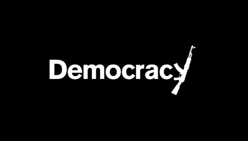
Democracy

5:45 pm 0 comments

Just noticed this while scouring the internet for good examples of visual literacy. I thought this piece tied in nicely with what we are doing at the moment. I suppose it sort of ties in with visual synecdoche. I just thought it was nice and simple and got the audience to think about the government and power.

If you wanna look up the designer, this was done by Plan-B Studios
We started a new module on tuesday. Visual Language, ooooh I here you say. I felt like a bit of kid in the first session. What seemed like cutting and sticking with coloured paper made for some 'interesting' results. No-one can get to a computer and make everything look pretty, and people are forced to pin their interpretations up for everyone else to see. I can see why we did it as we had limited scraps of paper to work with, and it got us thinking visually but I just felt that it didn't really give me much help for the brief we had which was due in a couple of days.

Below are a few shots of my ones. One of them was done by Mitch. I gave him the word 'cheese grater' to represent and he did it pretty well really. See if you can spot it. The other words I tried to represent were 'Confusion' 'Mirror' and 'Chatter Box'. Can't wait for next weeks session..


Well, I'm not sure about these as finals go but I really can't think of any other way of presenting them due to the constraints of the brief. I found out later in the week that for this brief one poster had to use type and one had to use image and one had to use both. This in turn with the constraint of not being able to use black and white puts into perspective that I am not in control here. A lesson I know I need to learn but I'm bending the rules slightly with.

I felt the England flag poster did not need any updating as I was happy with the content and presentation. This would work as my type poster.


The next one with the word Violence on, however, did need amending. I adapted it so that it was the one I only used image in. The feedback I got from the interim crit was the letters weren't as legible with the deep green grass background, which was a fair comment. They also said that I could maybe make the text tie in with violence. This gave me the idea to use objects associated with violence to create the word. However, I felt this would make the poster too literal and I already liked the how I had constructed the 'i' 'o' and 'l' so I kept in that vain by using objects you would see at a football game. Although, I think the idea works I feel the execution of what I have done is lacking. However, its not and for the time frame we were given (3 and a half days). I prefer the other violence poster I did in the blog post below, however, I have worked to the brief and produced something I am relatively happy with. With that in mind, I am not too worried as we have been told its more about the ideas we have than the final piece, although I'd say the final piece was important to me.

The final poster for this brief is based around the alcohol idea I had. (See post below). I think this looks a little too plain and I don't think the font sits right for this type of design, however, the brief said we had to use the Guardian font so I have tried to stick to it. It's another good idea but the execution lets it down. I can't think of how I would do it any better though. It may look better with photography rather than vector and better typeface.

Overall, I enjoyed the brief but I felt I wasn't given long enough on this and the finals haven't lived up to my high standards. I really don't like submitting something I don't like but I will have to get used to that in this business. I can't force my ideals on people, lesson learnt...

Pinup on monday made me think that I could have done this in so many more ways. I liked Alex's idea, particularly the posted he did with the all the icons on. I got it straight away. It was a real clever where to display a message that can be read by all. Will Smith is an actor that we have all heard and know of. Using the face of a lesser known actor wouldn't have the same impact. Really simple idea but brilliantly executed. I also like the recycle bin one, purely for its aesthetics. It was pleasing on the eye and made use of stock that no-one else used.


I was set a brief and given the guardian newspaper. The brief was to read the paper and pick out stories relating to quotes that were given on the brief. I chose a quote in relation to football league tables. The quote read "Leeds 61117621063+411wwddl sep20 v Carlisle(a)". What got me thinking straight away about this quote was Leeds United's form. the wwddl lose part showed that this had declined.

Being a Leeds fan myself I am used to the highest of highs and the lowest of lows. I decided I would research into the clubs history and also attend the ground to take photos of the stadium. It was kind of like a bus drivers holiday but it was an excuse to go there and gork at it.

After thinking about Leeds history and what I could focus in on, I thought of how our champions league campaign came to an end. So cruelly, to the hands of Galatasaray. The previous night two Leeds fans were killed in Istanbul, where the game was being staged. At the time Galatasaray fans were blamed and to this day I still believe it had an impact on the players. The young Leeds team were visibly shaken up. As a result the policing at the game was so over the top. Matters were made even worse when a minutes silence was only observed by Leeds and their fans. The fans chants and booing played on the minds of the Leeds team and their taunts paid off.

This goes to show how violence does affect football.

Therefore, my topic of interest was football violence. After sketching mind maps and thinking up initial ideas I digitally produced 2 of the 3 posters we were asked to finalise for Monday.

The first one relates to using patriotism as an excuse to cause violence. The England fans were renowned for causing trouble and rioting in foreign countries. This poster was developed by using stats to shape the flag. To improve it I could add a few more statistics, however, I did not want to over do it. I think this gets my point across and makes for a high impact design. We were told not to use black and white but I just felt this would have the same impact as England flag is red and white.

The second looks at violence within the stadium and the general view. I displayed the word by using the goal posts as an 'i' and 'l' and the ball through the middle as an 'o'. The idea behind it is to show the word out of context, and also to almost mask it and saying it exists but many people don't know about it at all or in great detail. This is all about awareness.

My Third idea, which I haven't got an visual for is based around the problems of alcohol which lead to violence. Many clubs sell alcohol at the bars in the stadiums and many people drink before and after they go to the games. Anything can spark anger in people and make some people to take action. I just think alcohol is a major hindrance. The poster would show pint glasses with different quotes on each. One will say "just a quick pint before the match" and the quotes will lead to the final quote "Come here and say that you scummer". I like the simplicity of the idea but I am unsure if it will work or not.

I will post my finals later today.