Padd Solutions

Converted by Falcon Hive

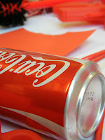
We decided to go for a day out in Bridlington today. The sea was choppy and the harbour front was freezing but I got a few more shots of drinks cans. Whether they are crushed, discoloured, cut up or in perfect condition it does not matter because that will give me more ways to categorise what I have.

I love the way the ones in the grass really work with that sort of texture. The long blades make the shot look much more interactive. Its cool. Last can count I had was around 35. Still a long way to go though.


This isn't related at all but I was practicing my camera usage and manage to take this lovely shot of a seagull. He/she modeled brilliantly too.


The question seems more relevant now I actually have some books thanks to my folks. I got four books for christmas. Two of which are full of graphic design nonsense and two dedicate to great british comedy.

My first thoughts on the question is that a book is something full of information dedicated to a certain topic. Books can be based on both opinion, depending on the author, and facts. Books help us gather a greater understanding on the topic in question.

A quote from a dictionary I have right here, which is also a book says "A bound set of printed or blank pages; a literary composition of fact or fiction".

An extended definition is as follows:

A book is a set or collection of written, printed, illustrated, or blank sheets, made of paper, parchment, or other material, usually fastened together to hinge at one side. A single sheet within a book is called a leaf, and each side of a leaf is called a page. A book produced in electronic format is known as an e-book.

Books may also refer to a literature work, or a main division of such a work. In library and information science, a book is called a monograph, to distinguish it from serial periodicals such as magazines, journals or newspapers. The body of all written works including books is literature.

In novels, a book may be divided into several large sections, also called books (Book 1, Book 2, Book 3, etc).


I don't think I'm gonna be able to get 100 different cans in 3 weeks, but I'm trying.. *hick up*


New Brief Alert! That's right. I have another research brief for over the christmas period. Yes, I wouldn't have thought they would give us any sort of time off to do nothing. It's another 100 brief and so I have set myself the challenge to find 100 pieces of research on drinks cans.

A lot of these I will buy outright to add to a collection, but I have already thought this may be quite expensive as not many stores sell cans in ones nowadays. So, I'll photograph a few in store too so I don't end up spending £50 on cans.

I have an example of the type of thing I am looking at. I have a small collection building up already and I shall be collecting more alcoholic, soft and energy drinks cans in the near future. I'll then be categorising them in terms of shape, size and contents, etc.

Forget christmas, it's drinksmas.. err yeah
I went to all three of Photoshop inductions, and the sessions were better than I expected, but I felt I had a good understanding of photoshop before I went. For something like the example I have posted I would have used Illustrator but this was a quicker way to create a vectorised look.

For this we copied the style of an advert the tutor had found, and used selections, layers and custom brushes to create this look. It's a little rough around the edges but may help me to develop my book for the photoshop brief. 
My first impressions on seeing this on the timetable was not good. I thought it would be some crappy little session and by the end we would not have a book that looked like a book, if you know what I mean. However, I was pleasantly surprised. Roger down at the print rooms is a top bloke and he knows a lot about bookbinding.

It took me more or less half a day to make a proper hard back book and the result was not that bad at all for a first attempt. It was pretty straight forward but the best books are bound when you get your measurements right. It was a bit to take in at first but I found my way and got the gist of it.

These are a couple of photos of the book at the half way point. I'd sewn my pages together and stuck the hessian stripes to the spine, and I had also added my coloured paper. After this, it was just a matter of cutting out the hardboard and gluing the vinyl cover before gluing the whole lot together.

The end result was awesome for a first go.

The last two weeks have been so what of an unnerving journey. Not quite knowing what I was doing, and quite where all this taking photos and categorising them would go, I finally got a brief to work alongside some of my fellow students Vickie, Ross, Pearl and Ed. After listening to what the guys ideas were on our area of study we collectively decided to looks into personal space.

My self evaluation of this brief is discussed below with the help of some set questions.


What problem did you identify?

The problem we identified was that the people of Leeds don't have enough personal space.

What evidence did you find to support your decisions?
We took photos of the busy high streets and carried out experiments such as counting how many people bumped into us when walking down various crowded streets. Commercial street was the worst by far. I counted the number of people on public transport to prove that buses were overcrowded and also counted the number of people sat in pairs. The interesting thing is that when the bus became less overcrowded most people chose to sit on their own.

What methods did you use to gather your evidence and what forms did it take? (categorise your research using primary, secondary, Quantitative, Qualitative)
We tried to get an array of public opinion, coupled with facts that we got from our experimentation and also secondary research which we gathered from newspaper articles and websites.

Primary (Quantitative)
Gathered statistics on number of people on buses
Counted people in town centre locations
Counting number of times people walked into us in various locations.
Facts developed from the statistics above.
Questionnaire asking whether people got bumped into around the city or not.

Primary (Qualitative)
More open questionnaires asking people about whether their personal space is invaded and how.
Photographs of people in city centre.
Brain storm on design sheets.
Quick sketches on design sheets.

Secondary (Qualitative)
Newspaper article on late and busy trains.
Examples of interesting map design.

Secondary (Quantitative)
Leeds 2001 Census.

What methods did you find useful and why?
I thought the counting and recording of numbers in public places helped us the most. This more or less formulated our design decision in the end to make people aware of the densest areas of Leeds city centre.

What methods do you find problematic?
For me I had a problem with asking people in the street for our questionnaires. I know alot of groups talked mostly to people on our course for their questionnaires so maybe they did not get as good overview as they only asked students. For us we needed to ask people who were in town and get different views of people in different age groups. I tried to get some people to fill in our questionnaires in the city centre but after 7 straight rejections I gave up. I thought maybe I was encroaching on their personal space.

How did you overcome this?
I decided to give some questionnaires to friends and family and posted my questionnaire online. Thankfully I had a few more replies because people could do it in their own time. I got the results I was looking for and also got p
eoples views from all over the world, not just the local area.

How will you address these issues in future?
I will make any questio
nnaires I do less demanding and perhaps try the internet survey again as I got a much better response from it. I just feel that people on the streets generally have no time for you. That might be because they instantly think you want to sell them something or you going to keep them too long.

What research didn't you carry out
that would have proved useful?
I think we spent too long on the actual quantitative research. The gathering of data was important but I think we could have been more visual in our approach. I think we needed more time to generate a solution eve
n though the solution turned out well.

What five things would you do differently next time?
1)Try to manage time better. It's hard bei
ng in a group because you never want to come across as a grumpy sod that only wants to work but that's just my attitude. I like to get stuck in and do it.

2) Experiment more. I think we concentrated too much on the data retrival and fact stuff. Ross and Ed were more or less the ones in charge of the visual element and I feel I didn't contribute to that side as much as I should have.

3) Don't rely on technology. Ed's computer screwed up, and he was away on the presentation day so we were thrown a little bit. We had loads of photos but the only thing we could stick up was experimentation results and loads of data plus our solutions. The visuals bit was missing.


4) Interact with the group more. I fe
lt I sat back abit and didn't really voice my opinion until later in the week. I got more involved on Friday and tried to make sure we won't going to be missing stuff out, and that we had everything for the presentation.

5) Don't do as much comput
er work. It's as if I rely too much on polished visuals. Graphic Design is different to design for digital media so go back to oldschool methods Adam.

List five things you feel you have learned about the design process over the past two weeks?

Group work can be effective.

Group work can be ineffective.

You can sometimes have no idea what you are doing but you have to just get on with it.

Research is a
powerful thing. It should inform every design related thing you do.

Research is not just a load of computer print outs.

Below is images of our research. As I said we developed a lot more factual and data based research rather than visual stuff. All in all though I don't think it was bad for a weeks work, particularly given the amount of time we spent together in a group.


This is my favourite resolution that Vickie produced. It's not only informative but it looks so good. It was not originally meant to be folded, I don't think, but it works nice as a little leaflet style map that could be opened out.


These are some of the photos that were missing due to Ed's absence. These images could have taken more of a role in the design of our resolution or even been added to our research presentations. Ed and Ross took these when performing an experiment of the busiest times in Leeds city centre. Really interesting results I do believe.
For this new brief our group decided to look at overcrowding in Leeds. We decided to do a study on to whether people are concerned about the day to day hustle and bustle of Leeds life. For this photographs would be taken as well as gathering data about different town centres and Leeds public transport.

Ed and Ross are taking control of the photography study. They will be taking photos in the same place every hour to get a view of when the busiest times of the day are.

Pearl and Vickie are doing some questionnaires for people to fill in and I will also be doing questionnaires on personal space and public transport. I will ask friends and family as well as posting some copies online.

I am also going to be recording data on the number of people on public transport from Leeds to Castleford, and hope my results will prove that we need more trains and buses running regularly to and from Leeds to meet the demand and make sure people hold on to their personal space.

We hope to develop our research into a some sort of solution by the end of the brief. Of course their will be constraints on time and such but I hope we can work as a group and share our work to create something concrete.

Edit: my questionnaire
Personal Space Questionnaire
Personal space has been defined as the area individuals maintain around themselves into which others cannot intrude without arousing discomfort.

1) Do you get jostled (pushed into or nudged) when walking around inner city areas? (Circle your answer)
Yes No

2) How do you feel about walking in a crowded environment? (For example if you were out shopping) and explain why.


3) Would you think twice about boarding overcrowded public transport? and explain why.


4) When boarding public transport do you prefer to sit alone or have no preference?


5) Do you think personal space is an issue within major cities and towns? and explain why.
I'm trying to get my camera skills upto scratch before Tuesdays visual language session so I thought I'd try out this technique which I saw someone do off my course last year. It looked effective so I thought I'd give it a try. The results were quite good, and is a technique I could include in my unusual photographic techniques.
I decided that I wanted to base my new research brief on unusual photographic methods. I knew already that I would have liked to try panoramic photography before scouring the web for good examples. I came across this guy on my travels around the world wide web. Will Pearson, a London based panoramic photographer.

After looking at his panoramic pieces I came across some 'Polar' panoramic images he had taken and I was just in awe. This technique looked so cool. I am still unsure how he created this effect, whether it be a special lens or a Photoshop job. Nevertheless it's pretty damn cool and creates this 3d effect that jumps out of the screen at you.

check out his website here.


On Tuesday, we had our first photography session. It went ok until I had to work the digital SLR camera. I thought I was going to be ok using them as I had used them before. However, I could not for the life of me figure out how to get a good shot. I came to the conclusion that I was only used to using the camera on an automatic setting. Once I had to think about f. numbers and iso's I was a little lost. Nevertheless, I have looked back over it again, and again, and I believe I have an understanding of how to work the camera to a degree so I can control what the camera does.

Here I have included some shots I took on my camera to show different photographic techniques.


Macro Shot


Large Depth of Field


Shallow Depth of Field


Selective Focus


Super Macro


Bracketed Exposure
This photographers style appeals to me. It's like nothing I have ever seen before. It's polished and unnatural, however, it features totally natural elements. There is a calm, tranquil feel to the images which makes them easy to look at. It reminds me of an office, which makes the calm and tranquil feel sit uneasy as we class an office as hectic and know it's the last place you would want to be.

I'm unsure why I was attracted to these images but they just stood out as a different approach to capture something like this.
I thought I should look at the work of other photographers. The brief suggested some to look at but I thought I would look at some images that interest me and then link back to the photographer.

This shot, by Wim Wenders appeals to me. The sheer quality and vibrancy of the image is what draws the eye. The colour of the skyline seems surreal but it adds tone and composition. The richness of the colours makes me want to experience the scene.

It almost seems like an action shot. There is plenty going on inside the frame and it makes you look deeper within the image to take in whats there.
New brief alert! Yes, that's right, our new brief entails getting 100 images. I thought that was a little over the top at first but quickly found that 100 photos isn't as much as you would think. This is the research stage of the new brief, so i do not know what I will be using these for. I was asked to get images of objects, places, textures, people and words.

I also was required to print out the 100 photos to a certain size and cut them all out accurately. (They don't want much, do they?) Nevertheless, this is benefiting me in some sort of way. So, here are a couple of photos which I thought came out really well.

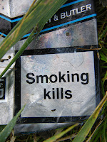
The texture is from when I was in Leeds, and is of a manhole cover. The weird structure is from when I went down to my local town centre, Castleford and took a photo of this 'art' piece, which is made out of plastic crates. The other is a close up of a disgarded cigarette packet and the last one is taken from the new multi-million pound bridge in Castleford. It overlooks a boat that got stuck years and years ago and basically rusted up. Locals wanted it removed at the time but it's become part of the history really.


The assessment is closing in and I thought I'd post one last time before the deadline just round up what I have looked at in the last few months and reflect on what I have learnt.

So, I have found the last few months pretty hard but not unmanageable. I knew I was going to get tested in the first few months with fast paced briefs, tight deadlines and so on. What I didn't realise is that by the end I would be proud of what I had done regardless of what the outcome is of the assessment. I know some others in the group do much more in terms of quantity, but that's not my style of working. I think I have changed my approach slightly to how I used to work, and its a change for the better, but I'm not ever going to be someone who does masses of sketchbook work.

I quite enjoyed this module and my work varied in quantity and quality. I found my feet pretty quickly and got into the groove even though it was difficult to start with. I have learnt more in this period than I did on the ND. I feel challenged and I feel as if the people around me have that bit of quality, which makes me want to push myself to keep up the standard.

So, to round up this blog so far, I feel I have a greater understanding of graphic design as a whole. It's not about creating digital solutions. That is just one tiny part of it that I focus on too much. I was abit of a mac monkey really but I have the ideas to back it up now.

This blog has helped me immensely. I can post and evaluate work and look at different designers work too. I just want this to grow and grow. It can then be a tool for research, inspiration, ideas, further self evaluation.

How do I think I've done? Pretty well, but you can't be sure what quantity of work is required. I expect that it is a lot. However, I think my work has been varied. I know I had a slow start and the amount of work I have done has grown for each brief. Comparing the first brief 'convince us, persuade us' with 'message and delivery' you can see there is a huge difference in quantity, and a huge improvement in quality. The print workshop did not go to plan. I was unsure if I needed more independent work on that and I'm sure there will not be enough work there. However, I hope other work will cover the flaws in that brief.  I have got printmaking as my elective so I am hoping to put more effort into it then. I did not really know what I was doing this time round.

My favourite piece of work is the typeface I created for Leigh. My original sketch on A1 trace was good but when I introduced Illustrator it took off and looked like a real typeface. I felt it answered the brief and Leigh loved it too. My A1 poster in Illustrator turned out nice too. I did not want to just recreate what I had done on the original poster so I decided to tell a story with the typeface as though it was about Leigh, rather than a random alphabet poster. 
As much as I think its kind of childish to stick down bits of paper at 23 years old, its not so bad when it's quick idea generation. It is useful to use these techniques I guess because it makes you not filter your ideas. You have basically no time so you might as well put what you think down on paper.

These are some images from today's session.


I was quite impressed by my representation of the phrase 'part timer' I drew a digital clock face and cut parts out but left some.


So, I have thrown together a few ideas and I like what I'm doing. I thought I may have to sacrifice my professional touch due to me being only allowed to use two colour and stock. However, they never said how many stock we could use so I figured I could use it to enhance my designs. I looked at using see through envelopes to start with and it did not really work but it looked kinda fancy. After doing some sketches and making some mock ups, I went to my first crit with a little idea of what I may make. Beer mats! It seemed like a natural progression from the poster I designed for the no news is good news brief.

These images show my initial sketches and my development work.


So, after this stage I started creating mock ups and experimenting with different stocks. I liked the idea of the red card being the solution so I definitely wanted that to be part of my resolution. David also suggested maybe I should use sugar paper for the beer mats.. it would give it a nice texture and hopefully feel like a beer mat rather than an advert or something.

After messing with a few ideas I made up some finals which I was happy with. I created a little fact sheet which would accompany the beer mat and red card so the reader got a better overview of what I was trying to create.

These are what my finals should look like. I'm still tweaking them based on the crit I had today. I think people liked what I had done and I saw a lot of work I liked too. Will's and Jonny's work stood out for me. Will's finals just looked so professional and Jonny's was really well crafted.

My finals...