Padd Solutions

Converted by Falcon Hive

The layout design of David Carson surely pushes the boundaries to the extreme, where type and grid is concerned. There has to be a carefully laid out grid under the huge amount layers Carson's work appears in. What I have learnt from all the books I have looked at, for my research, is that the grid is only guide and that it should not limit creativity. I think the grid helps us layout huge amounts of body copy effectively so it can be read and understood fully. I think how, as designers, construct the rest of the layout is more about aesthetics than functionality.

Carson's work arguably is more aesthetic than logical or practical anyway, as you can see by the examples. However, I think this amount of creativity and spontaneous mark making gives the spread character and I for one would be more inclined to read it or want to work it out. I suppose it all depends on your audience. People who are reading instructions or analytical figures would feel the functionality outweighs the aesthetic but someone like us who want everything to visually engaging would want just that in a magazine spread.

This spread was actually designed by Jonathan Kruse. The article is actually about David Carson and it encompasses his style in it but also shows a more conventional approach for the body copy but then by rotating it slightely it becomes a little rebellious, much like Carson's aproach.

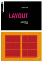


I decided to have a trip to the library and found some good books on grid layouts, because I would say I understand that less than the anatomy of type. The chose these books basically because they looked newer, and I have found that books which were published earlier seem a little outdated and not that relevant to today's design practice.

So, I got 'Grid Systems' by Kimberly Elam, 'Making and Breaking the Grid' by Timothy Samara and 'Layout' by Gavin Ambrose and Paul Harris. Just flicking through them in the library all of them were right up my street. They have plenty of full colour examples and they don't get bogged down in the technical side. Grid systems in particular has a nice transparent stock which allows you to see the grid placed over the finished artwork, which brings me back to my point about older books. That kind of thing would not have been done in an older book due to the technological constraints, but enough of that. On first impressions these books should serve me well and I will post up examples from them soon.
Ok, so we have another exciting new brief involving layout. This brief has evolved from some type and grid workshops I attended for the past few weeks. Now I have to accumulate all the things I have learnt from those workshops, eg. the anatomy of type (ascenders, descenders, bowls and so on), how to work in grids and columns, use the correct measurements (mm's, picas, points) and then design an article based on a fellow designer. In my case, the designer I got was Craig which is a good thing because I liked his work before this brief but had never spoken to him before, so I used my interview to get an insight into him before the course and also outside design, as I can take inspiration for this when I design the layout.

The interview I did with Craig went well and I certainly got a good amount of information from him. I am designing three dps' (double page spreads) in total and one of those will be an introductory piece of 500 words, the second will be the main body with 1,500 words and the last will also have 1,500. I did panic thinking I would have to write 3,500 words on him but luckily I found that we can re-use some of the copy.

This is what I have so far, and I am thinking that the main body of my piece will be interview based, because I feel it would just work better. My title will be 'One for the future?'. I will also feature some of his works and also some of the works of his favourite designer Peter Saville.

One for the future?

Craig Laing is a 21 year old student originally from South Oxley in Watford. He currently resides in Leeds where he is currently studying for a BA honours degree in Graphic Design at Leeds College of Art and design.

Craig has studied previously studied at Kensington Chelsea College and gained a good set of results for his National Diploma at the second time of asking. “I basically wasted my time the first time around. I acted like a t~@t and I just messed around.” Craig had to refocus on what was important to him, and his drive and determination for success eventually earned him a place on the Degree course at Leeds.

I had a chance to catch him out of his his busy schedule to get an insight into the man that is Craig Laing, both in and out of the studio.


What would you be doing had you not chose graphic design as a career path?
*He shifts in his chair, pondering the question with his hand on his chin* You know what, I don’t really know. I guess I would be in the army or something. *laughs*

Where would you be if you weren’t in the studio?
Hmm, probably listening to music or playing video games. I like all kinds of music from Norwegian black metal to James Brown, and everything in between. My favourite type of game would be strategy games. My favourite is Command and Conqueror: Zero Hour. I watch a lot of news on TV too. I just like to keep up on the current situation.

Do you have a creative background or family?
Yeah I do. My brother actually is the creative director at Hey Moscow. *Takes a drink of his hot chocolate* He crits my work and tells me how to improve it. He’s basically shaped me as a designer.

He would you describe your graphic style?
Erm, I would say it’s humorous but solid, it has a purpose but it’s also light hearted sometimes. It’s like Hitler on a stag do. I like the style of work of Peter Saville. He’s my favourite designer and my inspiration. My style reflects his aesthetically.

Do you prefer to work digitally or more traditionally?
Digitally for sure, but I did start out as more of a traditional illustrator. I used to enter competitions with my drawing and that’s more or less how I got into Graphic Design, that and the fact I was around my older brother all the time.

How would you describe yourself in 3 words?
*Ponders for a few seconds* Erratic, perverse, and vein.

Which do you tend to first impact or aesthetics?
Impact always, the Nazi’s would have got nowhere on aesthetics alone.

Is there any works that you are particularly proud of that you have done over the course of the last year?
I did a competition poster for Dontpaniconline.com which was part of a competition and I liked the spoof design of the monopoly board I did. That was based around the financial crisis.

To find out more about Craig log on to craiglaingbagd.blogspot.com

I found a cracking set of typefaces on this website, and I thought it ran inline nicely with what we are looking at the moment in type and grid. I have to say having 'Helvetica' as number is a little bit cliche and it's over use has prompted me as many other people to boycott it a little. It is a nice typeface but it just seems that everyone loves it but they don't know why.

'Glasgow' on the other hand is such a new typeface. I only discovered it this morning but I wish I could add it to my collection. It has a similar feel to the guardian font, and it comes in every weight imaginable and unlike other some other typefaces from light to extra bold it seems to fit perfectly. It does not look forced.

This module has been an odd one for me. I did not really start engaging with the line brief until the start of the year. Obviously that was my fault and I should have addressed it, and has meant that I had to work harder in the last few weeks but still come out disappointed with the work I have at the end. I had a nice final piece, which was engaging and interesting but the whole module seems to have passed by quickly and I have not got the amount of work I had on the other modules. This may be because it has been running in the background appose to other modules which I could concentrate solely on.

1. What skills have you developed through this module and how effectively do you think you have applied them?

I have built on my illustrative skills. I am not the best at illustration and I have stuck with it and have got better I think. The sessions on create visual representations quickly really put my crafting to the test, as I am someone who would like a little longer when creating something that would have to be shown to the rest of the group. I pushed myself and in those sessions because I started out and my attempts were like a pre-schooler.

The workshops on the whole were based on things I had never attempted before and although I was skeptical to start with and I did wonder why I was doing some of the tasks I can now see how it benefited. The sequence sketches brought about interesting results as different people in the group interpreted words and phrases different to me, so it was interesting to see how they responded. I think I have got quicker at being able to visual multiple solutions to a problem through doing the sessions.

2. What approaches to/methods of research have you developed and how have they informed your design development process?
The method of research I have developed mostly is the quick response to a problem, and by coming up with multiple ideas or visual links to a keyword whether it be a noun, verb or phrase I have learned to think quickly and this has helped save me time trying to come up with one perfect idea.

In terms of secondary research and gaining inspiration, I haven't really changed much. I still close myself off a little and tend not to look at books and magazines as often as I should. I look at the theory rather than work I admire which I can apply to my own ideas.

3. What strengths can you identify in your work and how have/will you capitalise on these?
The amount of careful consideration I put into my work and I feel that, particularly in this module, on the what is a line? brief, my work has flowed nicely to a good conclusion. There was a little rut I got myself into when experimenting but I pulled it together in the final weeks and created a nice final which took me a long and hard time and a lot of money to complete.

As stated before I think my illustration has improved to the point where I could use my own illustrations to work from and create something clean and polished digitally.

4. What weaknesses can you identify in your work and how will you address these more fully?
I did some but not enough outside the sessions. For example the icons and schematic diagrams I could have done more of, or more in the way of photography because I am still a little unsure about working with a digital slr.

I could have had a bigger range of sketches and general investigation into other areas of what is a line rather than being narrow minded in the end. I just felt that natural lines was a wide enough subject to give me enough to work with. I should have also dedicated more time on the development of a final design rather than jumping straight into it.

The only way I could rectify this is to do it on the next module. I think I would normally but I have genuinely felt the pressure of the course. It has been difficult but it has been worth the effort.

5. Identify five things that you will do differently next time and what do you expect to gain from doing these?

Spend more time in the library looking at current trends and finding inspiration instead of doing my own logical layouts and taking inspiration subconsciously.

I don't think I could have managed my time better because but I could have perhaps put more time aside for this module. The what is a line stuff was running in the background and the back of my mind up until February, and that is just simply not good enough for someone who wants to set a high standard.

Apart from those I can't really fault myself. I try hard, I attended every session and came wanting to work and improve, even when the agenda of the session was to stick down coloured paper. I was out of my comfort zone but I never complained. I am hard on myself sometimes and I come to the end of the module thinking, have I done enough and how much has everyone else done. I think I could have spent more time outside the sessions on the pictogram and icon stuff cos I didn't get the 30 done because I simply could not think of anymore imagery. I did do a few resolutions digitally though.

6.How would you grade yourself on the following areas:
Attendance 5
Punctuality 4
Motivation 3
Commitment 3
Quantity of work produced 3
Quality of work produced 4
Contribution to the group 3
My quote was 'A mark indicating position, connection or boundaries.' and I believe this answers it pretty well.

This is my final resolution for the what is a line? brief. I have never envisaged doing something like this when I began the brief but it seems to fit and its an interesting subject, for me at least.

I laid the book out with digital illustrations of most of the people I got finger prints and hand photos from. I traced them by hand first and then digitised them later. Overall I love what I have done, and I think it's one of the better pieces I have done all year.

I decided to use acetate because I felt it was pleasing on the eye as well as quite functional. The reader could compare their hand with the examples in the book. The see through page allows them to do that.

The biggest job for doing this was the laying it out and the actual binding of it. It's not perfect like a commercial book would be but its nice for the purposes of the brief. Because of the way I bound it, using acetate then paper to make up the pages I had to include a middle spread where I put a fingerprint showcase. That came out better than expected, so I am really happy with it all.

Now all I have to do is complete some outstanding back up work and we'll be golden.
So the studio for this brief came and went pretty quickly. Me & Lindsey both worked really hard this week. With all the other stuff coming to a head, it was hard to find the time and motivation to finish this by the deadline. After I stop feeling sorry for myself, I was on quickly with the final posters after the previous week of coming up with ideas and possible solutions.

Lindsey has to take all the credit for the great photography. She exceeded my expectations and I felt relieved to know I had someone as committed as her for a partner. She talked to a couple of strangers about taking their photos and luckily they agreed. The photos themselves came out really well and I had a few shots to choose from and find the ones which we both felt would work well on the poster designs.

Obviously, we did not have a huge amount of time to get people on board and set up photo shoot locations like the pros but we captured the thing we wanted in all the final shots, which was realism. The people all have a different personality which is enhanced by the way it has been shot.

I wrote the newspaper stories to accompany the imagery and I feel they fit quite nicely with the images we got and I hardly had to change the stories content, and that saved some time, due to the fact I had written all the stories prior to seeing the photos. We purposely picked people who had a different look about them, people who stood out or could be considered to be an example of a young negative stereotype. Appearance was a big thing for us.

I then started on the finals and quickly noted that I for one did not what the posters to have much of an aesthetic appeal. This wasn't a glamorous campaign that people would look at and say 'ohh thats a nice font' it was a campaign for change and to give people you usually wouldn't a second chance. I added noise to the photographs and changed the mode to black and white to take away the context of the photo.

The purpose and message or our designs was to give youngsters a second chance. Our research suggested that teens inparticular get a lot of negative press right across the news and so the older generation had a dim view of them because of what is news propaganda. We found few positive stories on teenagers so we thought this be readdress the balance a little and make people think that if we talked to these young people we would know their side of the story and find that they have done good in the past, despite the negative connotations and stereotypes attached to them.

The final posters all came out ok. I don't know what else I could have added to them that would not have impacted on the message. I feel at ease with them. They are not world changing in terms of aesthetics but the message is clear enough.

Here is the finals and below is the delivery of them out in the environment.


The images above are linked to the deilvery
These are my and Lindsey's final proposal boards. These show our progression through the brief and include the message we wanted to communicate and the way we wanted to deliver it. These visuals proved successful in the crit, even though some people did not personally like it aesthetically. The posters did communicate effectively and they also said we presented our proposal well.

These boards lead on from the last ones we did and chose to keep a similar visual approach to the last boards we did. We were happy with what we had done and felt the visuals fitted well in with our parental target audience.

They kept the serious tone we were looking for and the message was clear. I am also happy that the posters worked in both landscape and portrait and that the continuity was apparent across all of our resolutions.
I had a last evaluation/presentation yesterday, and I presented my work to the rest of the group. All in all it went down ok, and filled the 5 minutes I had pretty well. After watching everyone else's presentation too, I haven't noticed any glaring mistakes in my work. I think at this point I have to concentrate on getting the final finished and fill in the gaps in my development work.

My main concern is finding contextual references to link my work into. Where I got my inspiration from, etc. The truth is I just got all the data I had collected and put it together on the page to see what fitted where and what was the best layout to use. I didn't trawl through loads of books thinking I could copy or take inspiration from someone else's style.

The next step is to make this module my main focus, despite having other things to finish such as the elective and the current module stuff, I think that those modules can wait a little until I have sorted the rest out. I really have to prioritise my time and think about what 'needs' to be done rather than what I want to do.
For the book I am creating I want to use some sort of graph like layout. These examples are not that exciting but I am hoping that my resolution encompasses some of the features of this. I don't want the book to be analytical in any way because that means that if I did not get the illustrations exact and to scale my information would be wrong. However, I do want to incorporate a key to define the lines and use a graph paper style layout to pin point where lines meet and cross. So these examples are good for inspiration in that sense.