Padd Solutions

Converted by Falcon Hive

This brief has moved furiously quickly which benefited in that you have to generate 'stuff' quickly but bad cos you can't reflect on what else you could have done until after. There seems to be no time to sit and think but that could include day dreaming too, so thats probably not a good thing..

Me and partner Lindsey have worked well this last week and we gave a proposal on Friday as to where we want to take the brief. To answer the brief we focused in on stereotypes and saw this as a factor as to why we don't talk to strangers more often, we basically are told everyday by the media not to trust anyone or go out at night for fear of being kidnapped, etc. I find it hard to think I would/could be kidnapped, mind you.

So we pitched the idea to create some posters based around negative stereotypes but then attaching a positive connotation to them in the form of a newspaper story. As I pitched and looked enthused by our idea I looked around for a general nod of approval and all I saw were blank faces and wondered if the panel were 'getting it' but the feedback we got confirmed they did. Issues, such as aesthetics, with the boards were the main points made and also some people questioned the integrity of using a poster as the method for delivery but me and Lindsey both agreed this would still be the best way to deliver our campaign.

These are a few images of our boards, and also a couple of amendments I made to satisfy the need for a more visual board design.


Today was not only the start of a new week, it was also the start of the next part of the brief. After rumours were flying around about us swapping our project for another I was resound to losing our work. The rumours were indeed confirmed and everyone was a little annoyed. I, however, did not mind much when I realised we had inherited a really awesome body of work from Alex and Dan. We had to listen to them essentially brief us on what they had and the ideas they were working on and then we had to look at the work, and redefine things like the audience and shape the project into something that could be resolved.

Lindsey and I came up with some solid ideas for their work and it was all going well. I started to prefer doing this to our own project and was thinking forward to a resolution. That was before Fred decided to turn the project on its head once again, this time by announcing we would pitch the work we amended and then eventually give the project back, in our case to Dan and Alex. I was not best pleased, particularly when we saw how our project had moved on, this was not Alex's or Dan's fault at all, they had just put in their spin on it from what we had told them in the first presentation. In the end I think we have to decided to stick with what we wanted but also incorporate Alex and Dan's ideas too at some stage. Well.. we will have too as they were made to rewrite our brief, luckily they did not change much anyway..
I have been looking at how I could incorporate pictograms into what I already have. These could be positioned on the page where some of the less important lines are on the hand. I couldn't tell you who the designer is but it seems to fit in with the clean style I'm working with. The pictograms in book would represent hobbies of the person's hand on the page.


I have started yet another new brief. This time it is a collaborative process where I get to work with one other person. I wanted to make sure I had someone I can trust to work, because in previous briefs not everyone has pulled in the same direction. Luckily Lindsey stepped in and I believe I have a good thing going with her. She is more proficient with type and imagery than me, and I hope I can bring my software led skills to complement her input.

On Monday, we decided on the topic 'How to get people to talk more', which was something I briefly touched on in the last brief, so I thought I had a head start on that front. We delegated jobs making sure we both had plenty to do, and today we are rolling out plans for research and gathering data to work with. We have also instructed each other to note down ideas, ready to work with them tomorrow when we sit down and filter the work we have. We decided it was best to work alone at first so we then had a number of ideas to bring to the table tomorrow, I for one find it hard to think of ideas on the spot but I have already come up with a few possibilities that I want to run by her and she what she thinks. There is definitely no leader or person that takes charge in this partnership, I've seen on her blog what she is capable of and I want her to succeed in this as much as me. There is no underhanded approach with people doing work on their own and then saying we are doing this at the last second.

We aim to make this work and come out with something we both are proud of at the end, and if that means me stepping back and allowing for compromise, I am sure I can do that.

The first thing I have looked into is networking sites. I heard on the news recently about facebook harming relationships because people were relying on them to keep friends rather than talking face to face. So my first idea was a campaign to shut down facebook.

Here is a very American (i'm sorry, it seems us English don't have as much time on our hands to have these debates) video which gives to sides to the story of facebook. It's interesting, because both people have good points, so this could come down to personal opinion.

So, the final crit came and so did a few other problems... for me. The first thing that was said that my work was engaging and made the reader look at their own hand and compare the information. This was never intended as a palm reading guide so I am happy people do engage with it. Other issues were apparent too because of the continuity. My book was supposed to show the same theme on each page so it could be comparative.

One issue raised straight away was the fact people did not know what the book page was meant to be. I don't know if this is a good thing or a bad thing. Perhaps, it does not matter because it will become apparent when the book is produced.

Nichola, David and Tom threw ideas into the mix and advised to maybe look at using different ways to show identity. In the eyes, for example or other body parts. David suggested using a pictogram style which would replace the lines with hobbies and interests. This would work and I will look into it but to get all of this done in a week could be (will be) hazardous.

One idea I did think of during the crit was to use an eye and split it into sections like a pie chart.

Other suggestions were made but I think I know what I have to do. Some of the suggestions are more realistic than others.
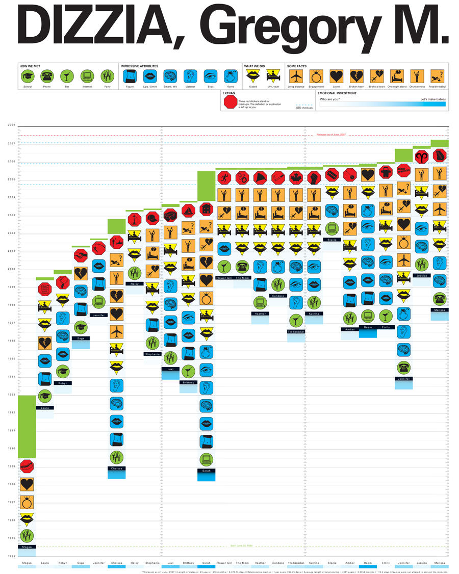
After searching the internet for good examples of diagrams and maps, I stumbled across this Feltron annual report. It certainly appeals to me in the sense that dull and boring figures can be presented in aprofessional yet visually interesting way. This report is actually a report of his life. These maps and diagrams reflect the travel, photography, music, food, drink and reading contained in the year.


There are many more examples at Feltron.com
I found this awesome book thanks to David, and I am just flicking through to find relevant examples which I can work into my own stuff. Now that I actually have some sort of format and subject, I am trying to focus down my investigation which has been all over the place in recent weeks. I have had no sense of time management on this and was confused about the outcome until last week. I do have some examples from the book but I am unsure as to whether they really do inform my design decisions.

I want to create a book which illustrates identity. I have had to move quickly on this so I extracted the fingerprints of 16 people and also took a photograph of their palm. I have formulated a page design which I want to have a continuous theme but not be boring. I have had to amend the rules as without the colour the piece just would not work.

I want the book to come to sort some of analytical end but I am unsure of what form that will take. I have had an eternity on this project but its been hard to get my head around, and actually focus on one specific area. Now that the focus is in place I can move on.
I have really tried to tackle this project in the right way. Take inspiration from secondary sources, draw on ideas from primary research and integrate a style of design that suits my target audience.

After randomly selecting 'how to play 20 questions' I was really pleased. It really could have been much worse. I had a few ideas and I have managed to work in two main ideas I had and evolve the initial concept I had. My product was aimed at children and teenagers on long journeys. This seemed the most likely situation that I thought where they would want to know how to play 20 questions.

Buses and trains were a good place to start but then I started to think about children going on holiday with parents, and I then I started to develop my ideas to become more family orientated. This seemed to fit better as the designs I was creating for children would not have been appreciated by teenagers. However, younger children could still identify with a more 'grown up' approach because of the natural aspirations children have to be older.

I did a little market research to see where my target audience went and what they did, and where they eat. The fast food restaurants such as McDonald's and Pizza Hut seemed to be most children's choice of food. I went to these places to ask about what they provide in terms of entertainment for children, and got a sample from each restaurant. Most of the things I got were pictures which the child could colour in. I found that most went on holiday and most were bored on long journeys. Many of the older children listened to mp3 players or played games on their phones.

This made me also think about how much news coverage is dedicated to children watching television and playing video games. The natural progression from there seemed to be that I should devise a campaign to give children and families the opportunity to talk more through the use of the game. This meant kids were occupied but were also bonding with parents and siblings.

I decided in the end to create a card, that was like the design of a credit card which the child could carry around with them. It would perhaps make them feel important and fulfil their aspirations of maturity and independence a little. The instructions are on the back of the card. I took inspiration from the Chris Collenberger illustrations for the logo I made. I chose to use 20Q because that is what the game has always been referred too as.


The next step was to create a poster for buses and trains where children could text the number on the poster and recieve instructions on how to play via their mobile phone. This may also indirectly appeal to a bigger audience and is also a way to get people talking on public transport instead of burying their heads in the metro or closing themselves off to the rest of the world via mp3. I decided to use a 'colouring in' style for the typeface because of the research I where I collected stuff for kids from McDonald's, etc. I found colouring pictures, and books to be prominant features in all of the childrens entertainment packs.

The design decisions, I feel, were well informed and help tie down my audience. The use of colour, typeface, layout and logo would appeal to a younger audience, and the language use would appeal more toward the parental side of my target. The reason for using slang was to make the design more personal and the language could be changed for different areas of the u.k.

Overall, I am impressed with how much thought and time I put into this project. I feel I have got strong resolutions built on a solid concept. This was one of the more enjoyable briefs I have had.

Edit: had my crit/evaluation today and some issues regarding target audience were raised. I didn't really make clear that the target audience had been developed from children who were bored on long journeys to families. Hopefully my evaluation clears up any doubts people had.
I have decided to give my 'How to' brief resolutions a hand drawn feel to them, and I have taken inspiration for that from the new carphone warehouse brand identity. It seems to tick those boxes in a world which seems to require 'organic' and traditional graphics.

This stands of for me and really love the t.v advert created by CHI&Partners, which is both cleverly animated and simply illustrated.


This is a quote taken from the CPW website.
We’ve represented this in our new look with a hand drawn version of The Carphone Warehouse logo and a specially created hand drawn font.

This new look and feel can be seen across all our Communications, both external and internal and features in our launch adverts, A 60 second history and There was a time.
The new logo pictured here is a breath of fresh air compared to the usual heartless logos created for the phones4u and other mobile phone brands. CPW already had established a market status but this hand drawn identity has that personal touch which the audience want.
The website continues with the theme running alongside their usual advertisements.


I decided to just look at everything and anything in the library, and pick out some examples of on the edge design. Nothing can be more contemporary than the examples in magazines, right? I was flicking through this months designweek and found a really nice typographic example. I think you'll agree the typeface, setting, background, position, and all those other things are spot on in this piece. I love that offset of colour, but more so the actual shape of the letters and how they can be manipulated to be taken in as one image.

I haven't begun to read all of the copy but already I just love it. It's as though the copy and message is irrelevant because here I am staring at this piece wishing I had done something similar.


Seen as I am looking at illustrators at the moment, I thought I would post the work of another illustrator who has inspired some of my designs for the 'how to' brief. These particular illustrations are for masterfoods, who supply nutritional snackfood for kids. These child orientated characters are both eye-catching and simple. They just seem to fit with my sort of target audience.

I just like the style of them, the use of colour makes them jump from the screen and can be used both on screen and in print.

This is definitely the type of illustration I would look to take inspiration from on my project. Of course, Berger does not stick to children's illustration, he has a diverse approach which takes on many different styles depending on the target audience.