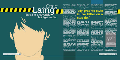
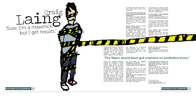
Back in the work groove. first ideas and mock up for magazine article
4:35 pm
•
Design Practice,
OUGD103
•
2
comments
 I know I'm premature here but I could not sketch out ideas and then never try to create visuals for them. I have a few ideas floating around and I have them down on paper. I haven't decided on a final idea yet but this has made me rethink. I started out with my sketch and set up my document size and margins which was all fine. Then I got the artwork I wanted for the background. I decided on a few typefaces, some of which are featured here.
 I wanted a square format and a four column grid. The type size needs reducing I think because I only could just fit on the 500 words, which are also subject to change anyway. I think I want my final to have photography of Craig in it and I hope that my ideas for that will be possible, all bearing on whether Craig will have some spare time. So, this is just an example and mock up of what could come of this brief. I, personally like it, but it doesn't set the world alight, but then again it is legible and it has a nice format and composition.
What I did find is that my sketches needed tweaking on the computer to look how I wanted them to look. This tells me that I need to work on my strategy for problem solving when not at a computer. I have done this kind of thing for years now and I understand it probably is not helping. I shouldn't go to the computer without a clear focus but surely it doesn't harm to tweak things.
Now I have to decide on an idea and do a full scale sketch with all the type hierarchy I intend to make use of.

Wow Adam these look great, realy they do! Well done you busy body
thanks Becca, I just can't seem to leave the computer. It's too difficult